Article Anton Sofa

article_anton25.JPG

This post is sponsored by Article.

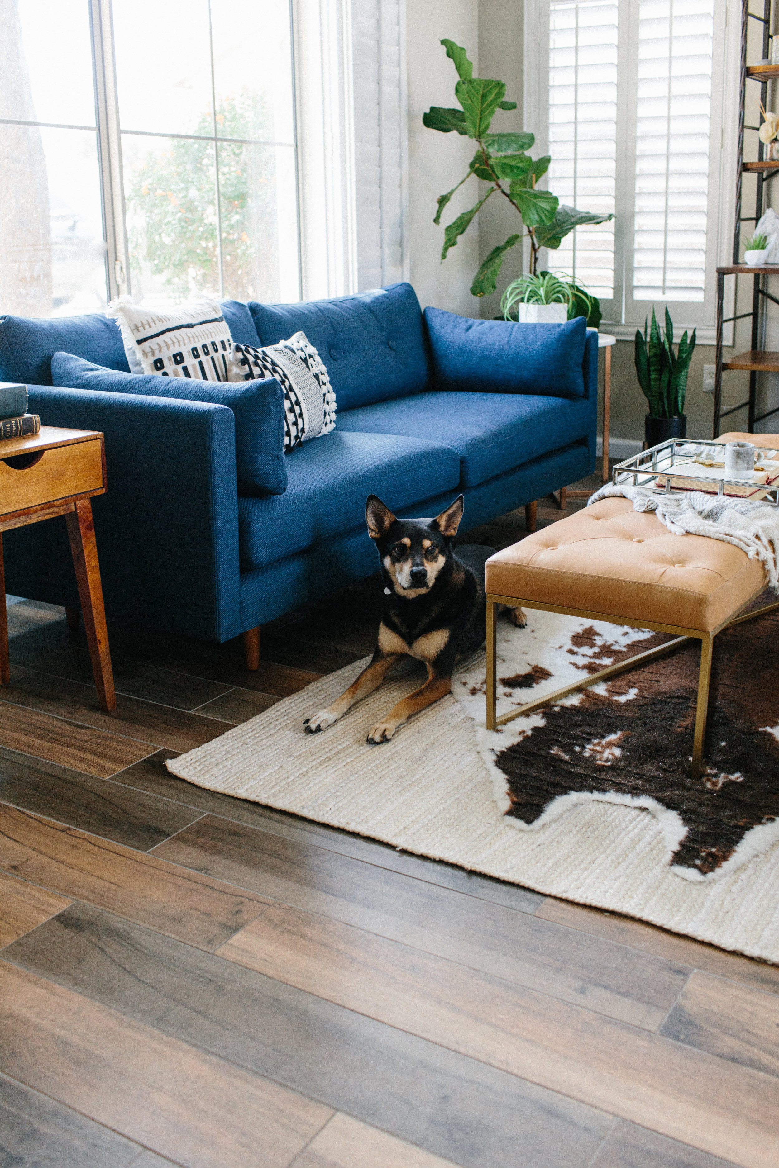
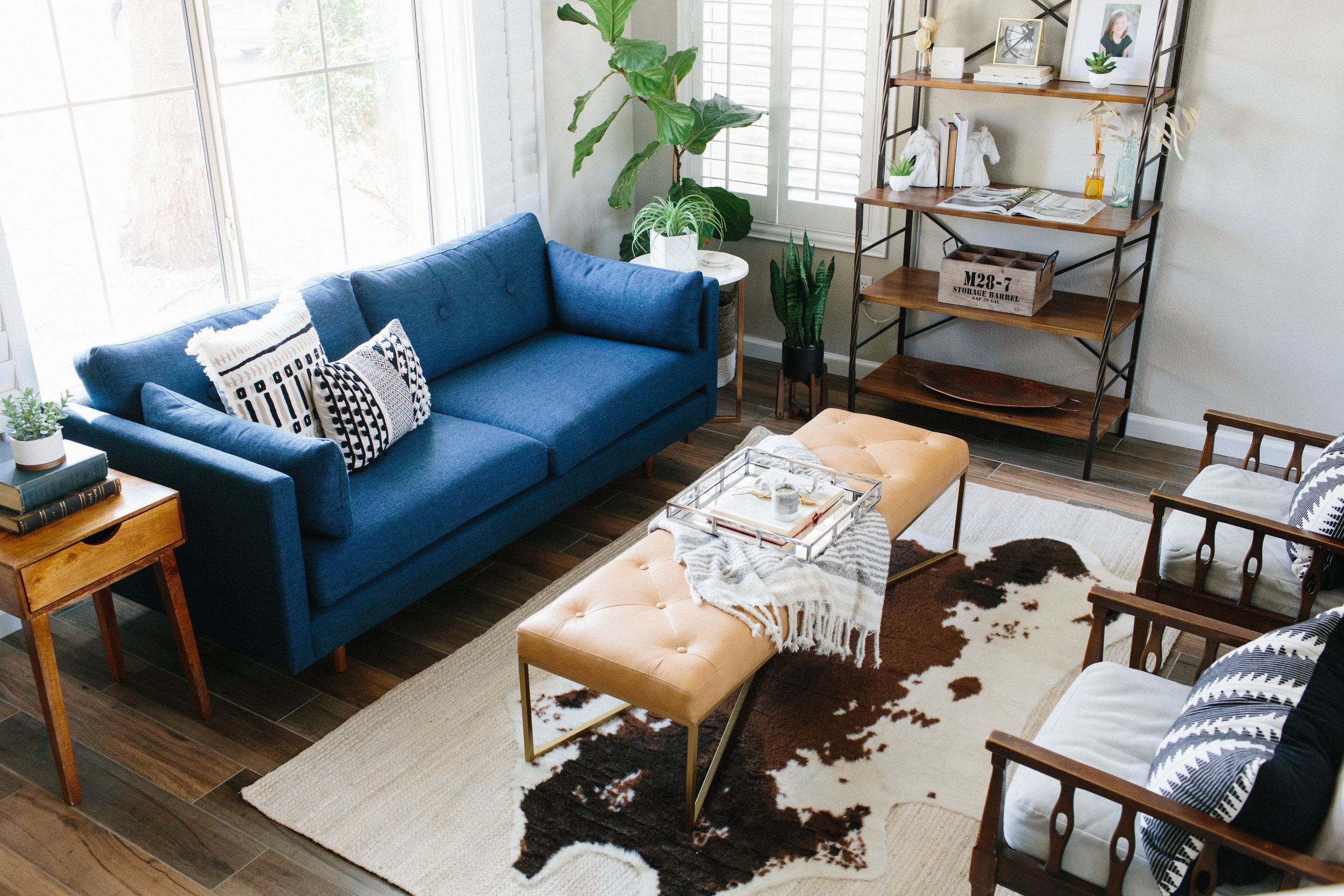
In a sea of neutrals it’s nice to see a pop of blue. Don’t you agree? I’m still not over deep gem tones, teals and blues. The Anton sofa by Article was just the perfect pop of color in Rennai’s home. I had the chance to style her living room, and I had a lot of fun playing up patterns, textures and color.

article_anton03.JPG

If you’re looking for a stylish couch with durable fabric definitely check out this sofa. I have the Sven in Birch, and I love it. However, this blue sure makes me smile when I see it. Sometimes you just need furniture in your home that does that for you.

article_anton01.JPG

Something else to note is that this bench is from Article as well. You don’t always need a coffee table to complete a space. Leather adds a lot of warmth too.

Article is just amazing, guys. The quality and design is THERE! Check them out!

Photos by Rennai Hoefer

Family Room Update

008.JPG

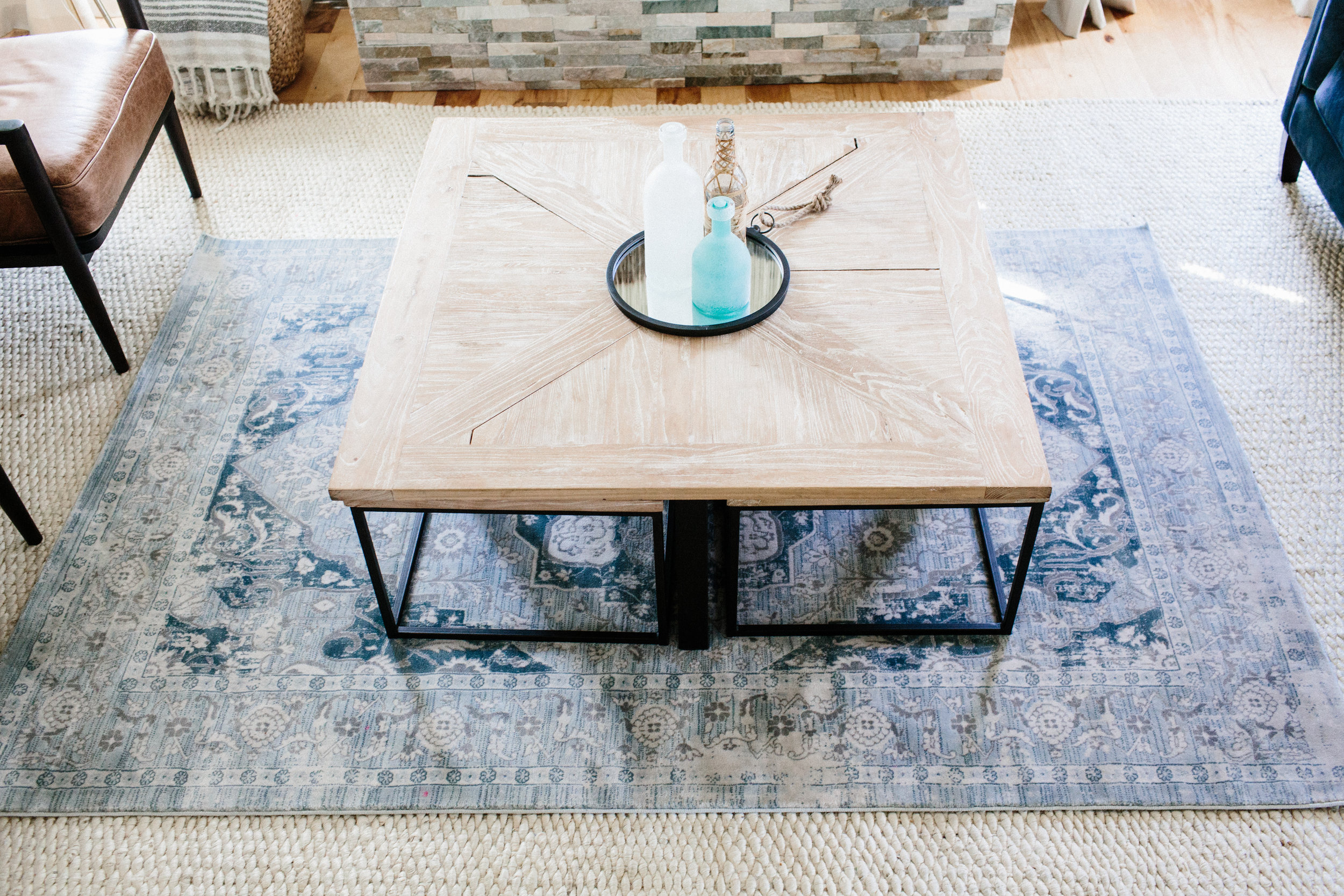
With divorce comes dividing assets. A lot of the rooms that I finally completed are now incomplete once again. My family room has gone through some changes since I made it over with Home Depot. My blue velvet sofa is now my main sofa, and my animal skin rug is gone. My chairs are also gone. So, a lot of the furniture from my the formal sitting area is now my family room furniture. I kept the bleached jute rug, but I added a blue traditional rug from Natural Area rugs to layer over it. It ties the blue sofa in nicely. 

003.JPG

Area rugs can be a challenge, but I really like layering because it's cost effective. Jute area rugs can cover more square feet for less, and then you can splurge on a colorful traditional rug if you want. The great thing is that Natural Area Rugs have affordable prices on all kinds of rugs. No need to hold back. 

005.JPG

Though it has been sad to see so much change, it has also been good to slowly rebuild and make things my own. New memories in new spaces. If you are looking for affordable area rug options, definitely check out Natural Area Rugs. 

002.JPG

Photos by Rennai Hoefer
 

THE PERFECT GRAY CHAIR

This post is sponsored by SIXPENNY.

I must confess a big home design mistake to you all. It's one that I made two times over. I have purchased two sofas for our living room without reading any reviews or much research. I based my choices purely on the advertised pictures. I didn't even measure my space beforehand. I just eye-balled it with full confidence everything would work out. Well, it didn't. The colors weren't right and the sizing was off. But, I have learned from my old ways, and I no longer go with just aesthetics. I only buy from trusted, quality furniture companies, and that's why I love SIXPENNY.

They are a furniture company that not only offers beautiful, modern designs, but guarantees satisfaction and quality. Each chair and sofa is made to order. Mine was shipped to me within a week of my order being placed. They also have a 30 day satisfaction guarantee and no restocking fees. That's so rare in the online furniture buying world.

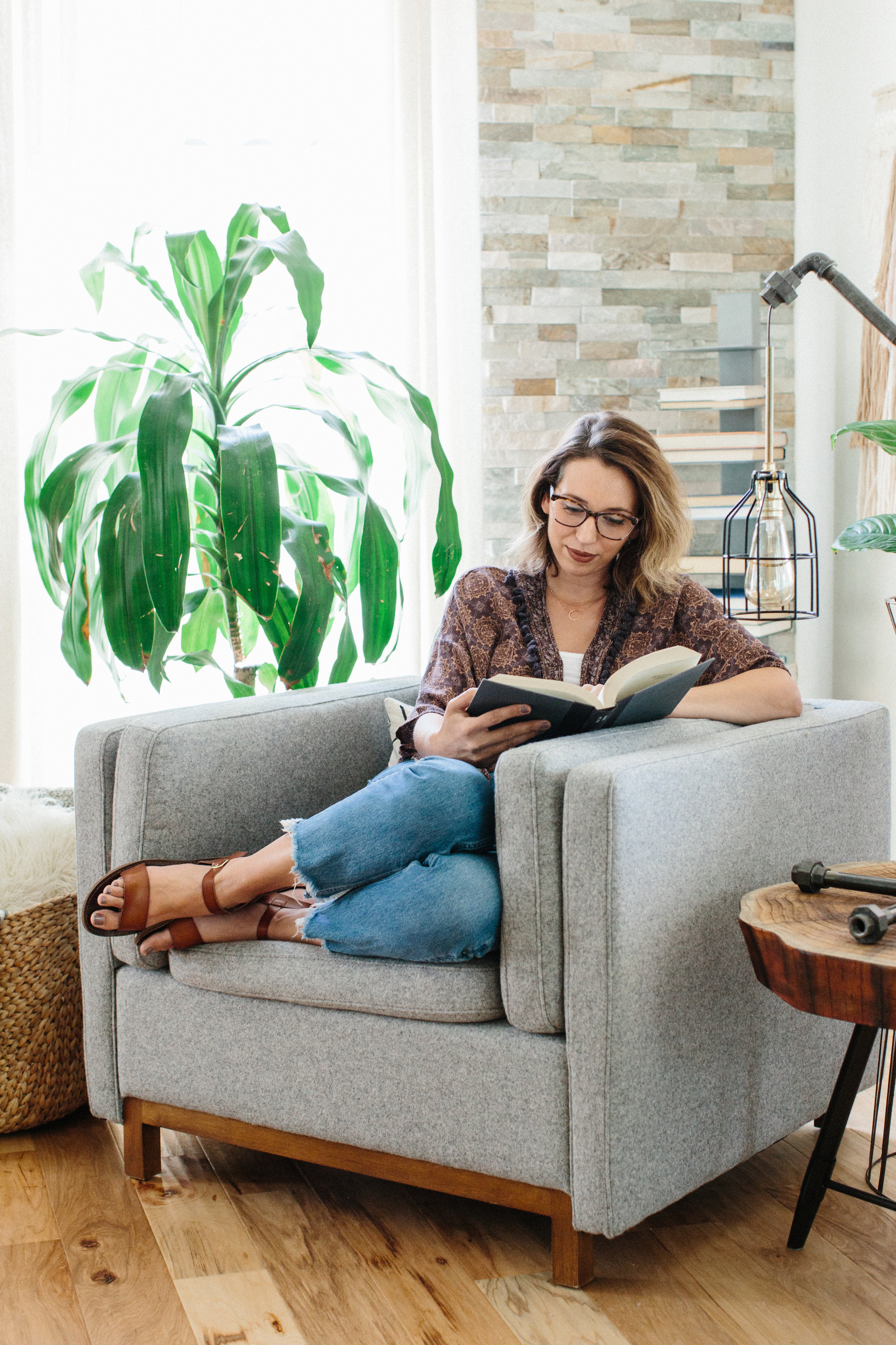
I love online shopping, but the other challenge I face is figuring out if the colors are true to the photos. With SIXPENNY, what you see is what you get. I got their ARLO chair in the gray wool, and it was exactly what I thought it would look like in person. I love it because the seat is deep and you can really lounge in it.  Right away I could tell it was well made, and it's now my favorite seat in my living room. 

The only thing is that this chair is going to be moved upstairs into our bedroom/office space soon. So, I guess that means I will have to buy another one. ;) If you're looking for modern, quality furniture at great prices, definitely check out SIXPENNY. 

Photos by Rennai Hoefer
BEFORE & AFTER: LIVING ROOM REVEAL

This post is sponsored by World Market. All opinions are my own. 

We are coming up on our 1st anniversary of living in our new home, and I can honestly say it feels like our home now. After transforming the bedrooms (master, girl room, nursery and guest room), updating the kitchen, and sprucing up the dining room, we have finally completed our living room and truly made this house our own thanks to Cost Plus World Market. It's arguably the space with the most transformation because we had to fill in a sunken in room with 10 inches of gravel and 2 inches of concrete.

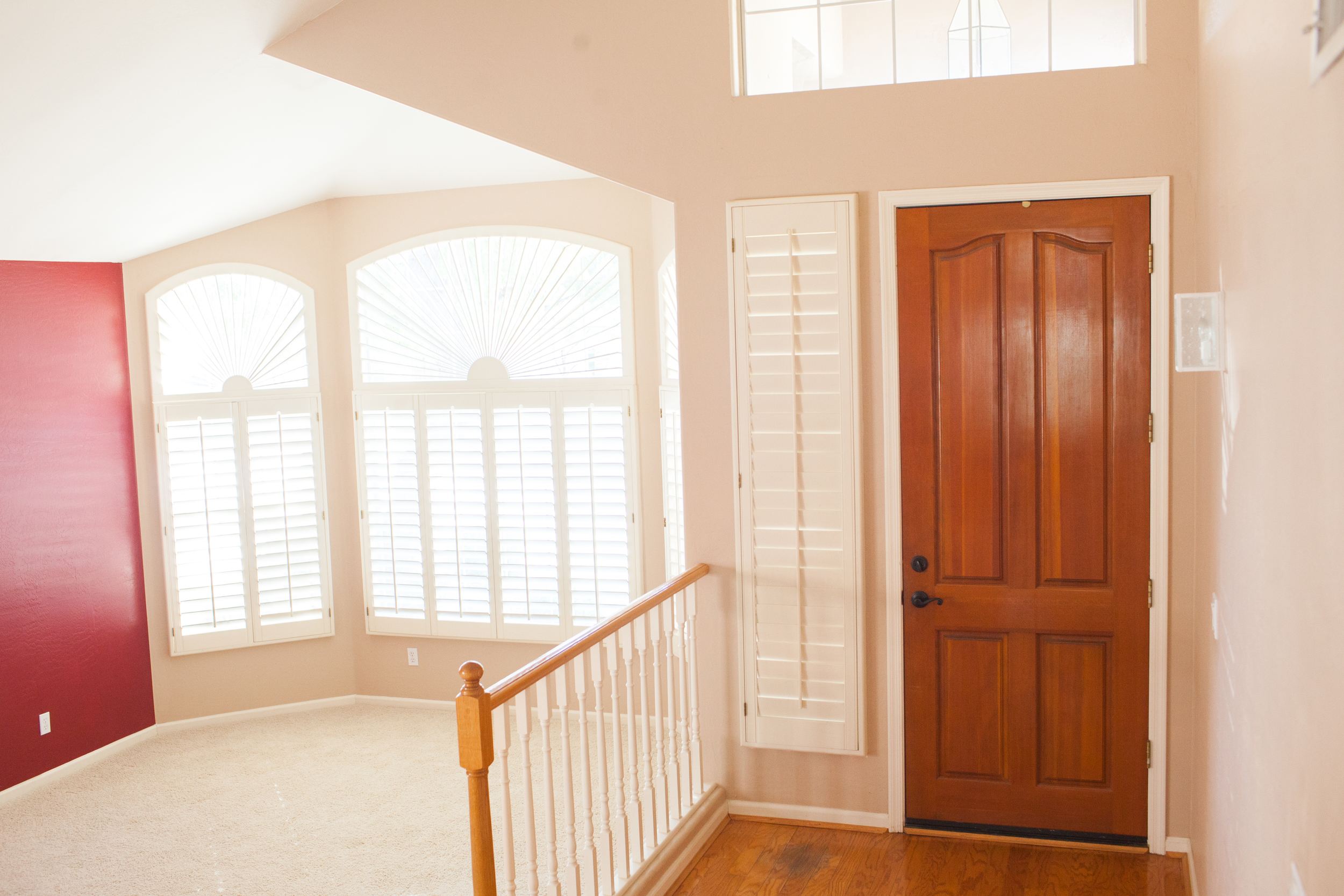
Formal living rooms are usually wasted spaces in homes, but I was determined to make ours one worth living in. After-all, you pay good money for that real estate. I'd love to share with you the elements that I included to make this space one that we would use often. But first, let's see the ugly before pictures so you can see how UN-livable the space was.

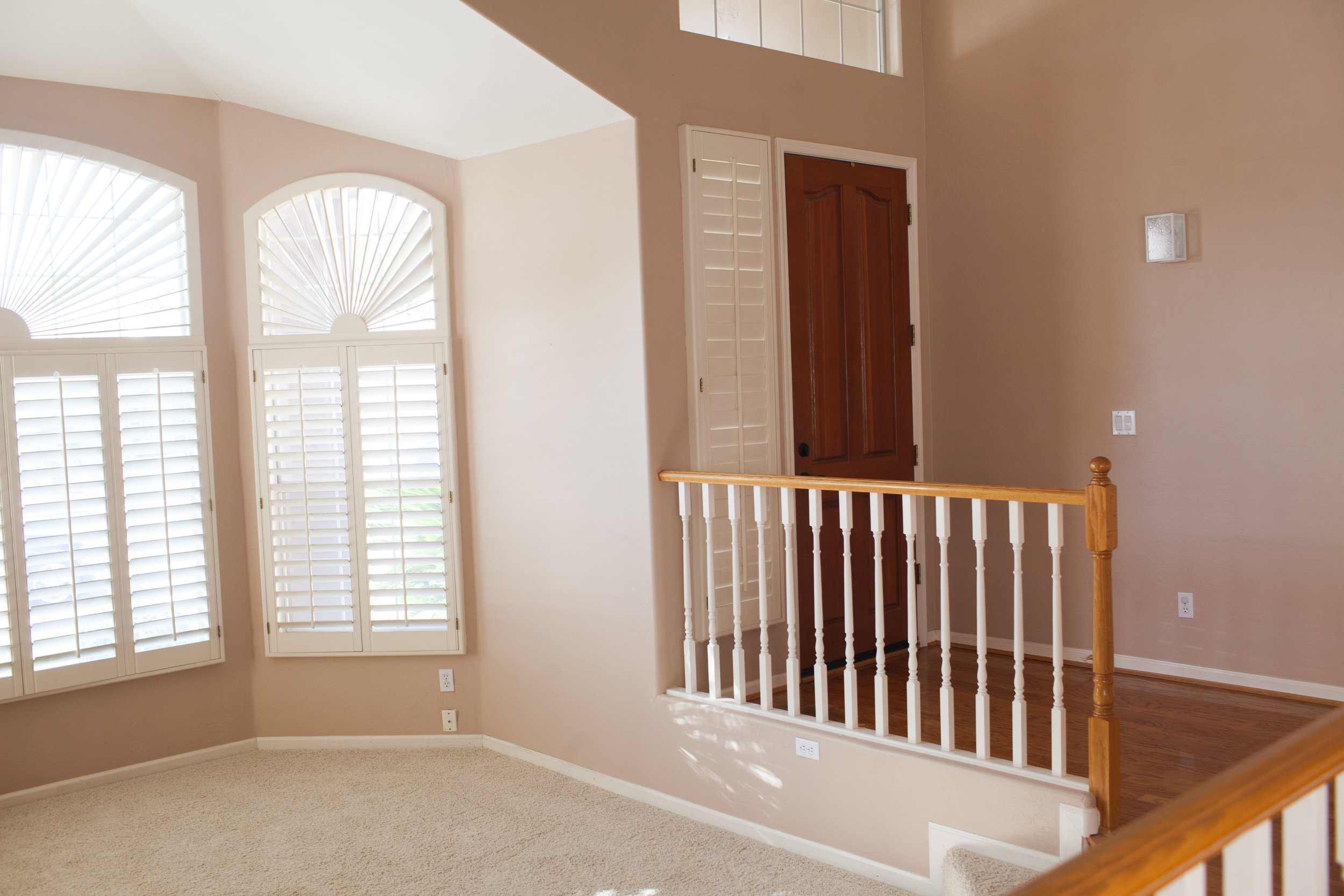
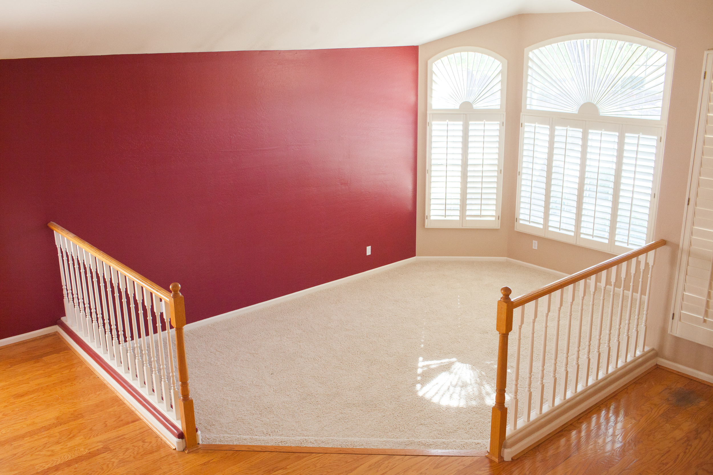
This house was built in 1993, and hadn't been updated since it was first built. Sunken in living rooms used to be a popular design element, but not anymore. Not only does it chop up the space, but it's not easily accessible. The banisters made the living room feel secluded from the rest of the house.

Eek! But, the reason we bought this house was that it had great bones and tons of potential. So, after filling in the living room with concrete to make everything level with the rest of the house, stripping off the banisters, painting the walls white and adding wood floors we had a beautiful blank slate to work with. 

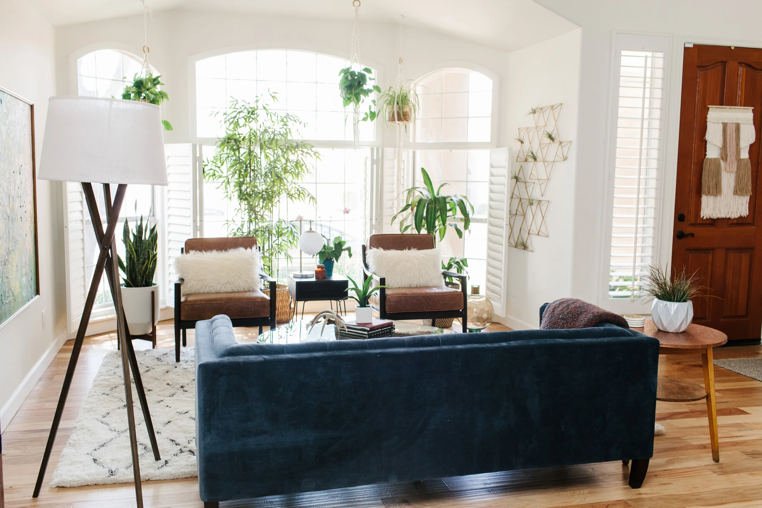
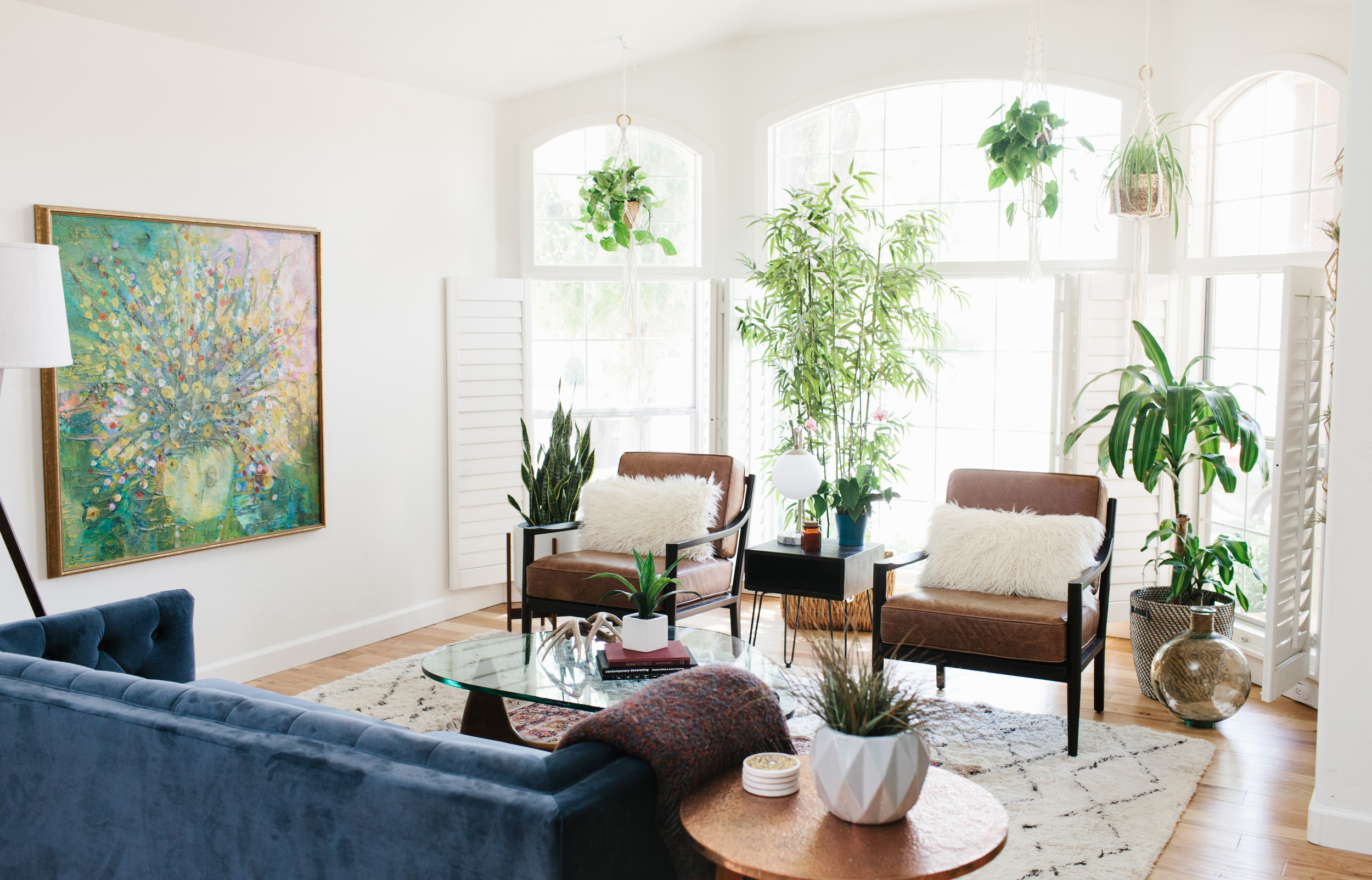
The first element I made sure to include in our livable living room was plants. Having living things in your spaces makes you come back and care for them. Plants also provide oxygen, and with these tall windows, it was the perfect home for them. I love the popular design trend of using macrame planters, and I used them to bring the eye upward and fill in the empty space above (made by Sonora Handmade). I also made sure to have several plants on the ground to even out the green. My favorite "planter" is this geometric brass wall art from World Market. I decided to use it to host several air plants and add some interest to an empty wall.

The second element was creating a conversation circle with furniture. We already had a shag rug, vintage rug and a mid-century coffee table to start. So, those elements kicked off the inspiration for the space. Having enough seating for our family and guests is important. Our previous home didn't have a formal living room, so we purchased additional furniture for this space. I fell in love with this blue velvet sofa from Cost Plus World Market. It was unique and it married my dining room and living room perfectly with the color. We added two mid-century style leather chairs, and placed fuzzy throw pillows on them for texture.

To separate the chairs, I found the perfect mid-century style accent table at World Market that had hair pin legs, and then I found a brass mid-century table lamp to to with it. I love the unique bubble shape and marble base.

Good lighting is important for conversation. This room had plenty of natural light, but at night we needed something more than just a table lamp to illuminate the room. I spotted a cool wooden tripod floor lamp at World Market and grabbed a linen lamp shade to keep with the soft elements of the room. It was exactly what we needed.

The third element to our livable space is including inspiring art. For my birthday, my mom let me have a painting I had grown up with in my childhood home. It just so happens to be my favorite piece of art because of the memories I have staring at the colors and texture. It makes me so happy when I look at it every day.

This room has become my favorite space in the house. It's cozy, modern and inspiring, which are all of the elements that make me was to live in a house. You can shop the room below, and head on over to World Market STAT because that are having a big living room sale. Many of the items from this room are from their latest Naturals collection and on sale, so go quickly!

Shop the room:

Photos by Rennai Hoefer