Neutral Nursery Design

011.JPG

I've never designed a space for another person before. In fact, that wasn't even the plan for Rennai. You see my dear friend and photographer is pregnant with a beautiful rainbow baby. She has gone through two losses before this pregnancy, and so celebrating this baby is scary and hard and wonderful all at the same time. 

So designing a special space for this baby is party therapy, part scary, part exciting for Rennai. She knew she wanted a rocking chair from Article. She chose the Embrace chair, which completely lives up to its name. It's so beautiful and comfortable. 

009.JPG

With a rocking chair chosen and crib that she already had from her previous kiddos, the room was already taking on a mid-century modern vibe. She doesn't know the gender of this baby, so we tried to keep things fairly gender neutral. Although, it started leaning more boy to the end. That's nothing that a swap of bedding and the art can't fix though.

008.JPG

Whenever you put a rocking chair in a nursery make sure there is a table to set things down next to. You'll need it for bottles or a breast pump or your own water bottle. It's a MUST have. 

After doing this with Rennai it really made me want to help other friends design spaces. I don't know if that's in the cards for me right now, but maybe one day. 

Photos by Rennai Hoefer

LEVI'S NURSERY UPDATE

Levi's Nursery Reveal - AVE Styles

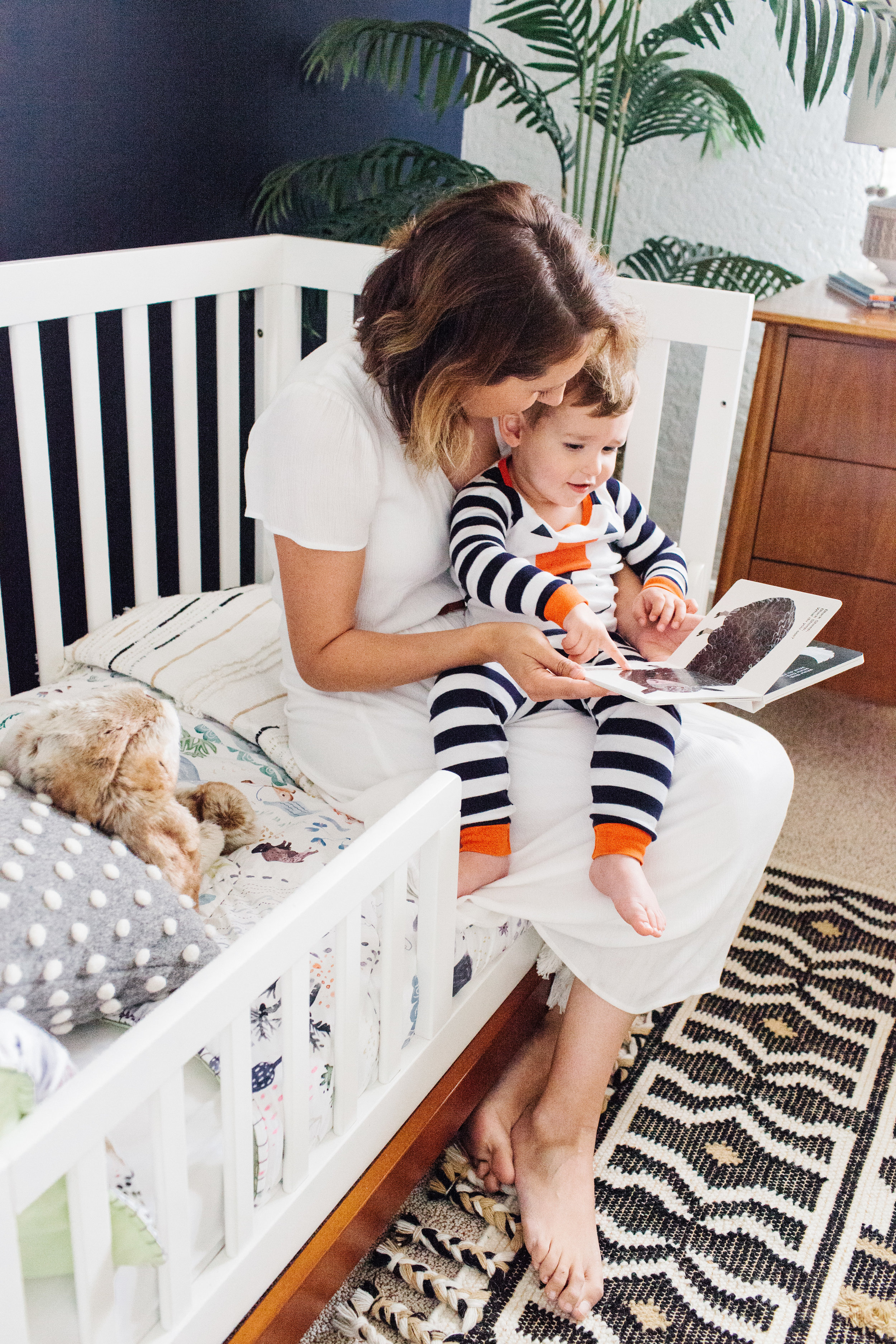
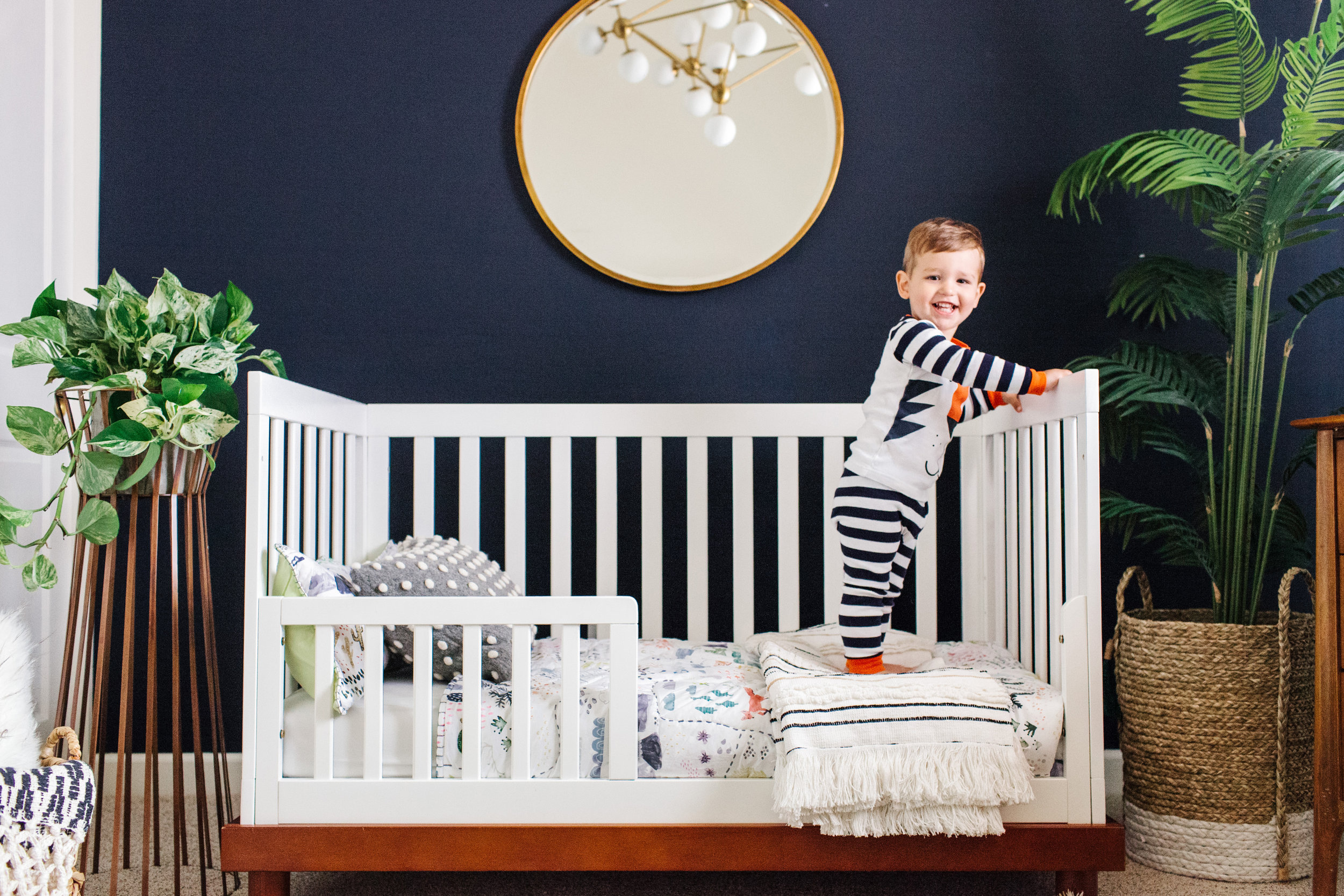
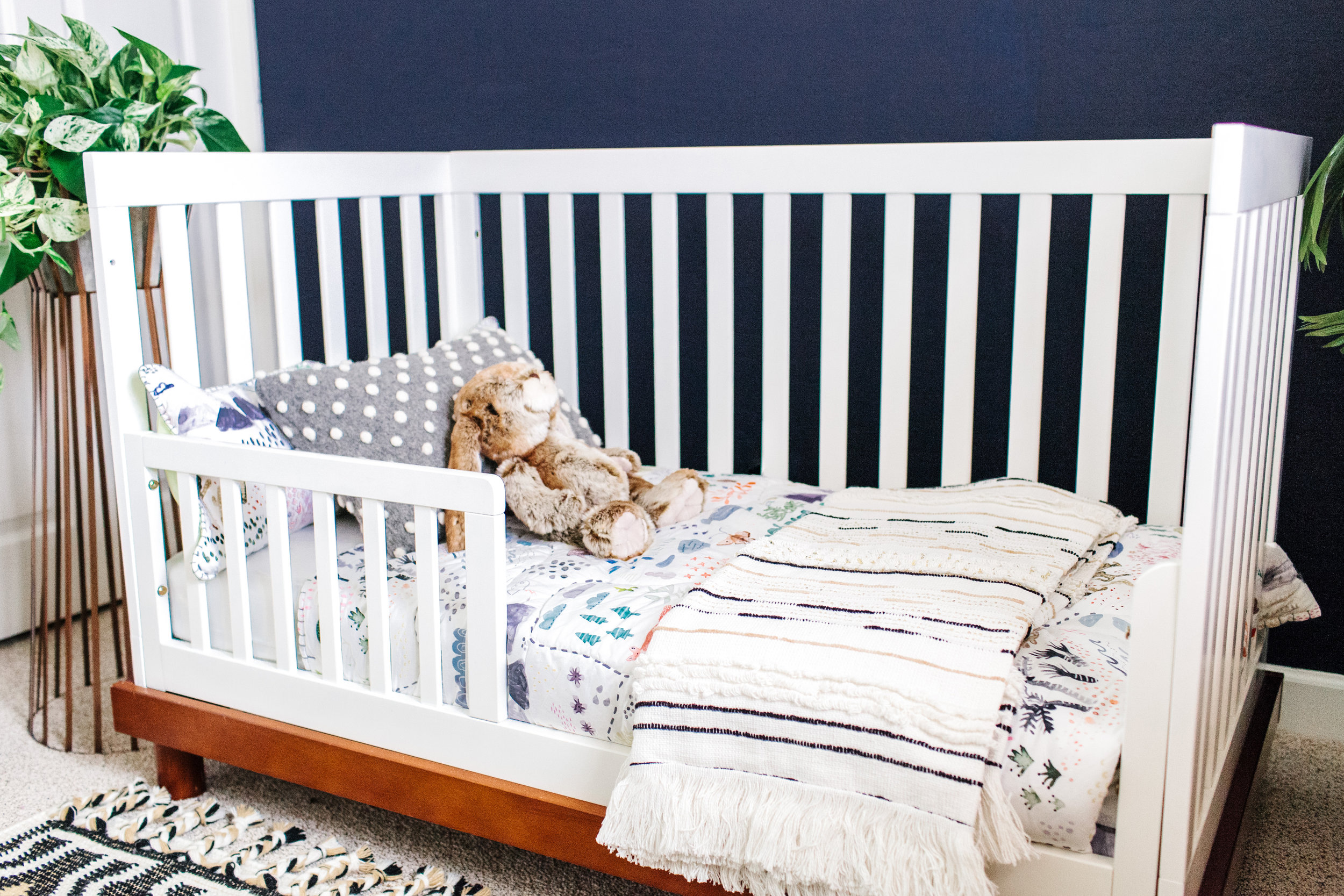
I can't believe Levi is a toddler. Where has the time gone? Recently, Anthropologie and I partnered to update Levi's nursery to a toddler room featuring their adorable toddler bedding. Now that Levi knows animals and can make their sounds he especially love this animal bedding. 

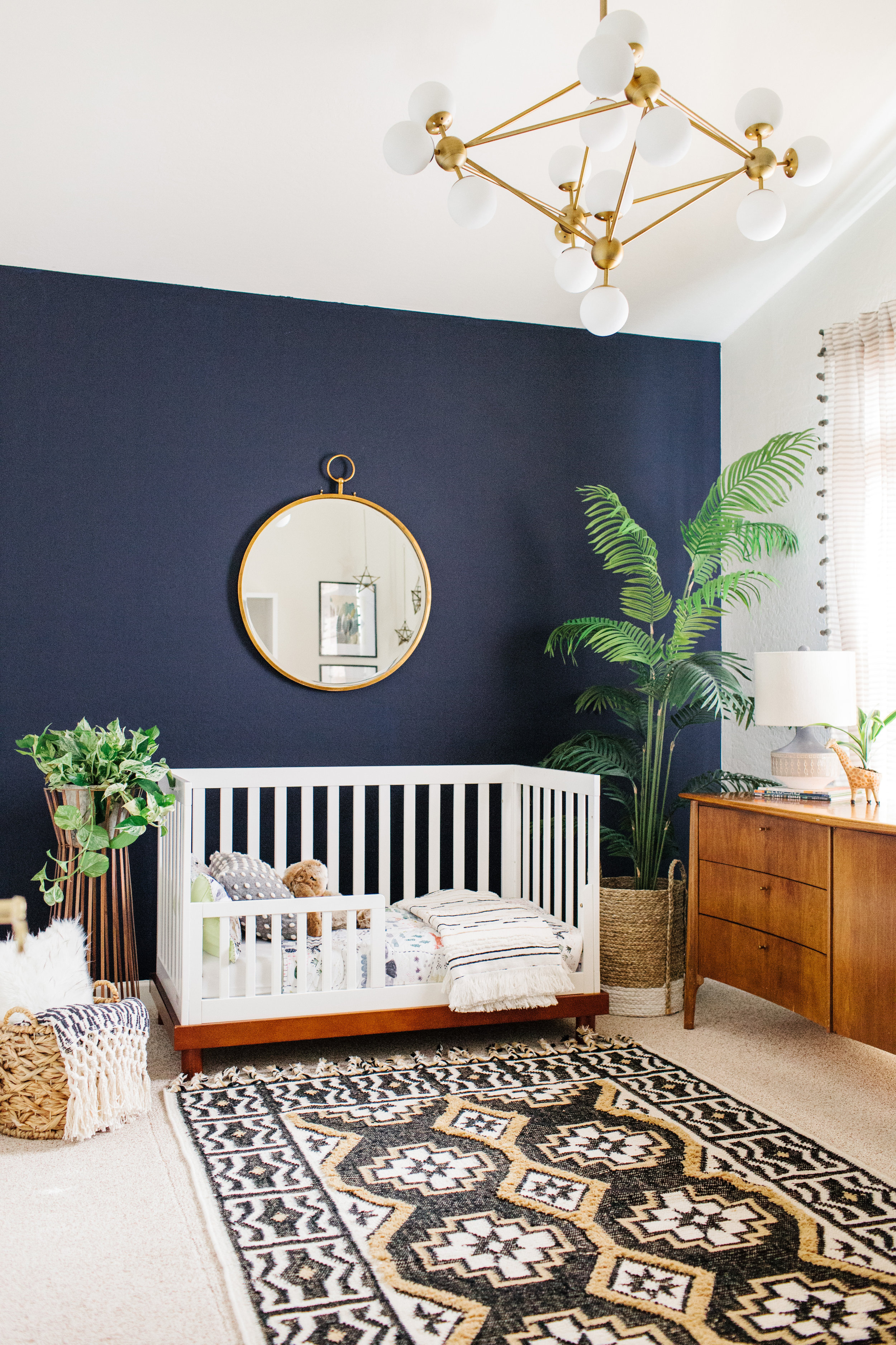
I was really nervous to change a thing because I loved it the way it was, but when we knew we had to get rid of his other rug due to allergies I thought it was a great opportunity to add a bit of boho flair to it similar to our master bedroom.

Black, tan, navy, gray and white are all neutral colors I love and I decided to put them all into one room. I also mixed stripes, polka dots and other patterns along with the animal bedding to create a bohemian feel. 

Levi's favorite part of his updated room is the bunny. It's the softest, cutest stuff animal I have ever felt. It's a great gift for a little one. 

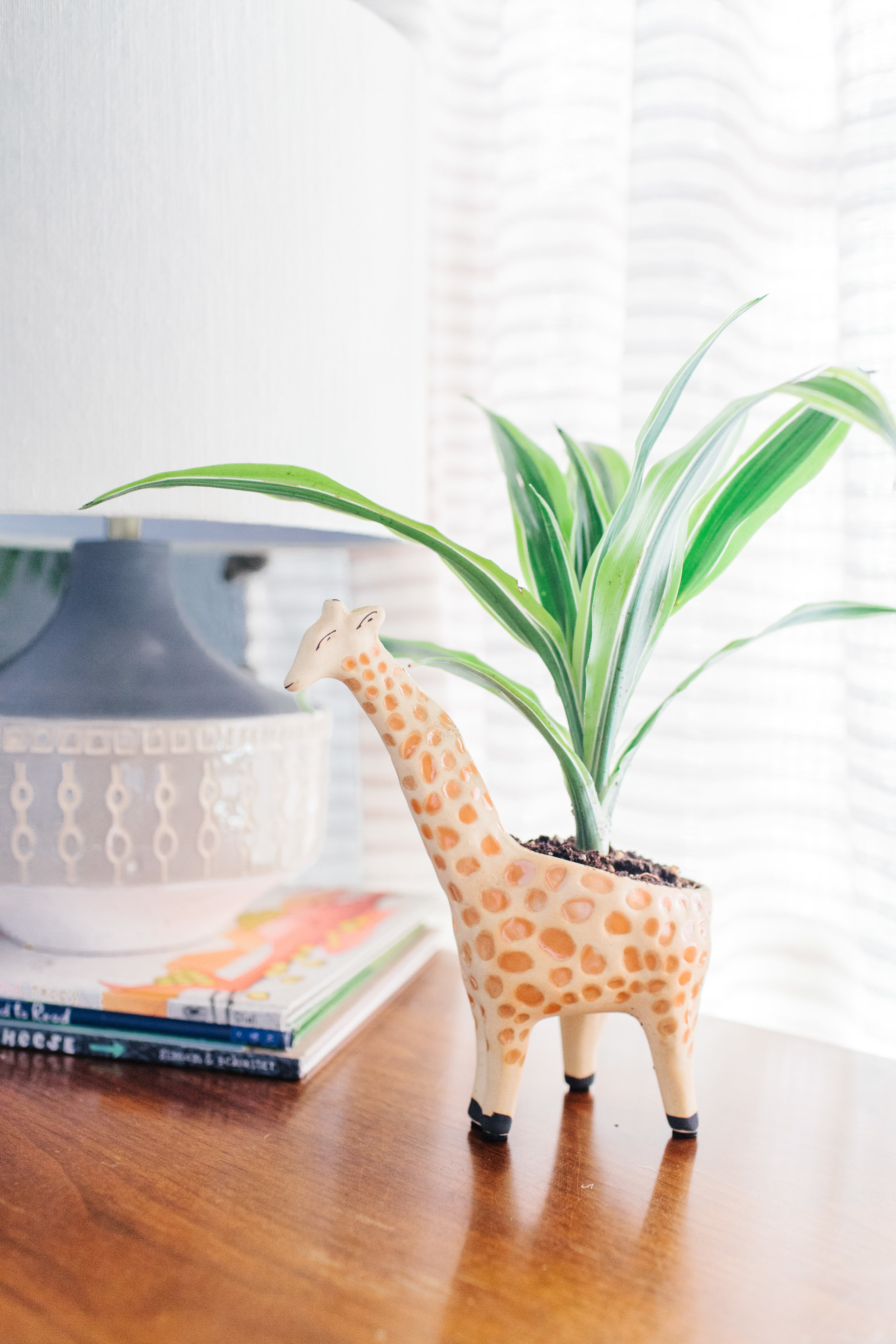
Adding kid elements to such a rich room is important to me. That's why I love this little giraffe planter. That's also why I love his kiddish bedding, and why I added a polka dot pill size pillow.

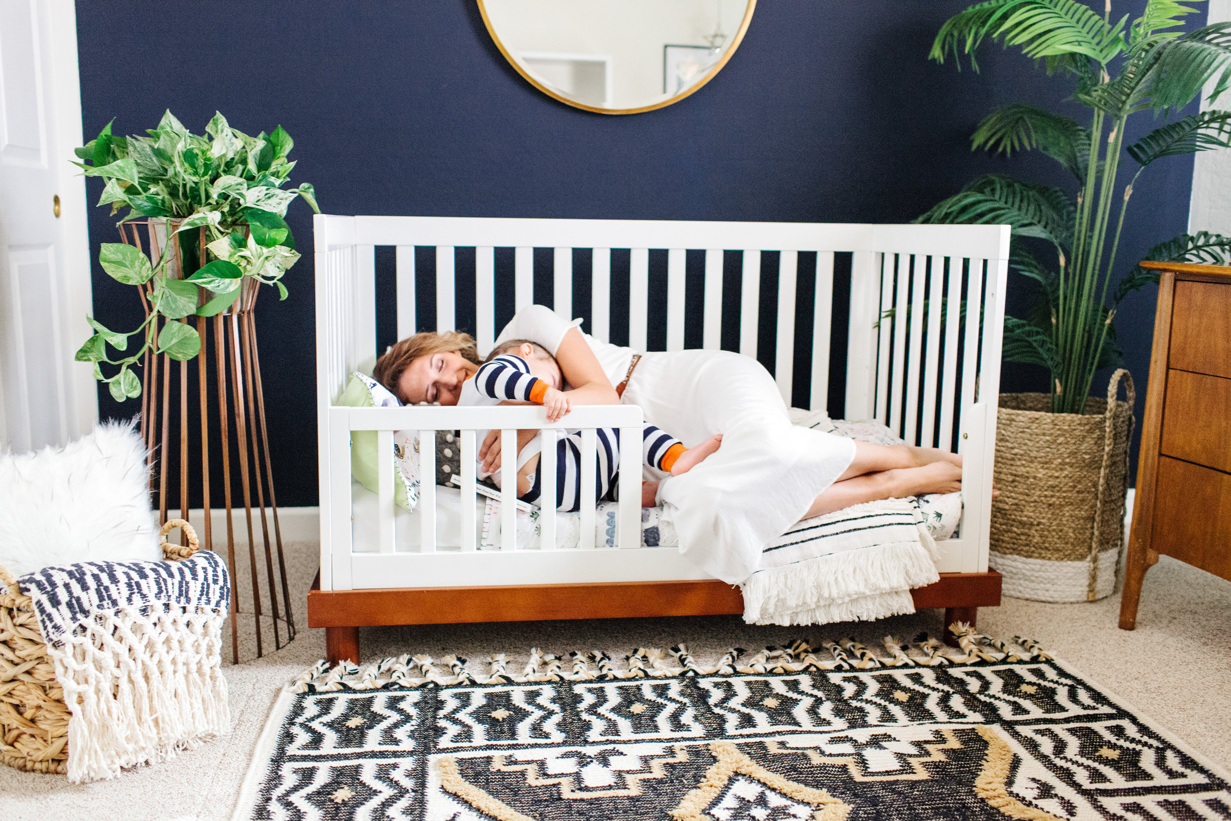
One of the sweetest things of converting his crib into a toddler bet is that I get to snuggle with him even more. Now to keep him in his bed...

Photography by Rennai Hoefer; this post contains affiliate links. Product was given as payment for images of this room.

ADDING HOLIDAY CHEER TO YOUR NURSERY

This post is sponsored by World Market. 

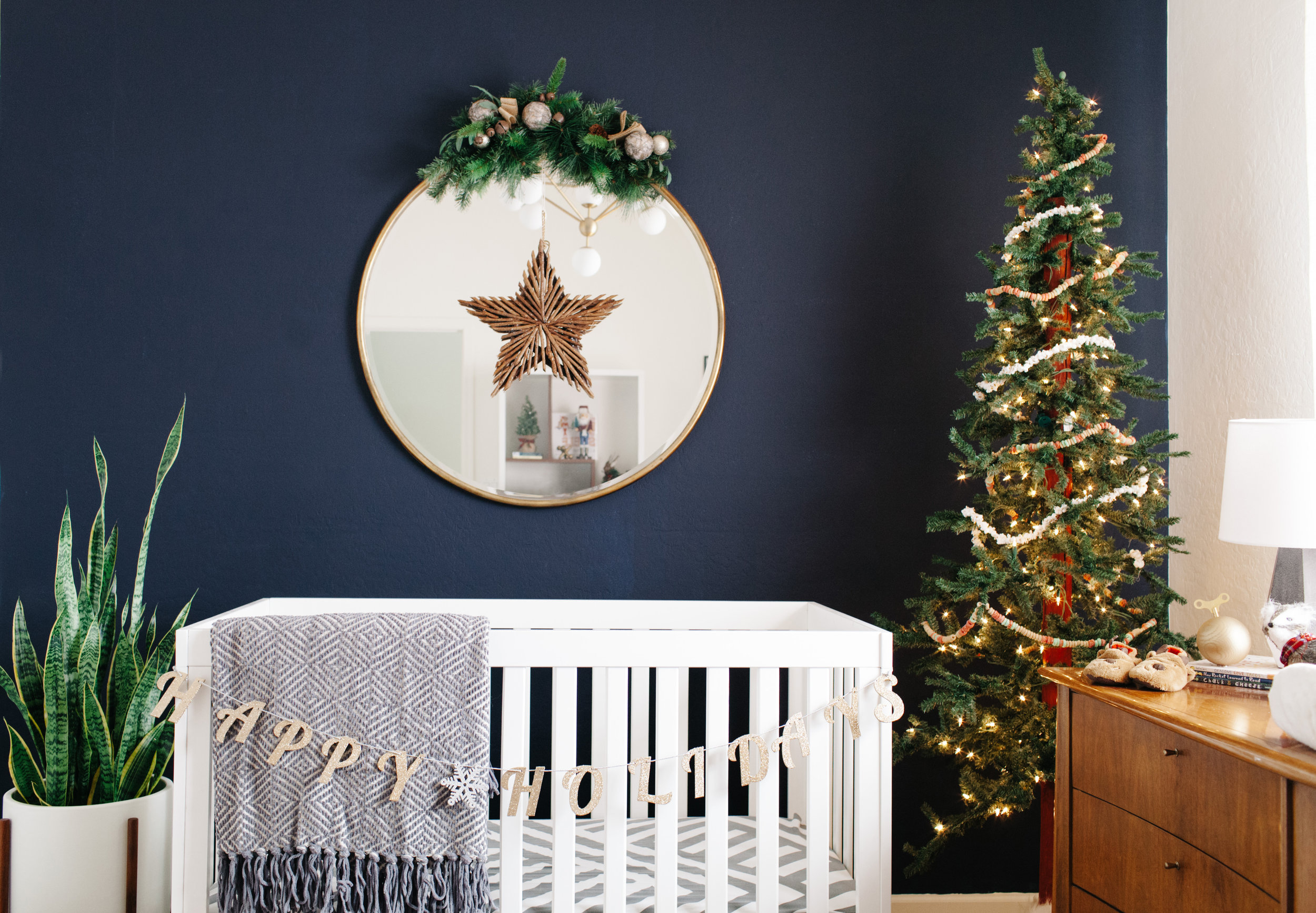
Experiencing Christmas through the eyes of a child is magical. The excitement they have for their stockings, the twinkle lights and all of the ornaments doesn't even compare to mine. So, it makes complete sense to me to sprinkle some of the holiday magic in their bedrooms. I've partnered with World Market to show you how I've added some holiday cheer to Levi's nursery.

His nursery is already rich in color with navy blue, gray, maroon, and gold making up the majority of the color palette (see his original makeover here). Bright red would obviously clash, so I went with more of a woodland theme for his room with a touch of muted reds. World Market had everything I needed even down to the little critters of the forest like glittery porcupines and foxes.

Since the mirror is the focal point of his room I added a wooden star in the center and some greenery on top. I also picked up the coziest gray and white throw. I really want to steal it and put it in my living room now.

I also added a gold garland to his crib that says "happy holidays" (note: I do not recommend placing a garland on your crib if your child is older than a newborn. They could potentially pull it off and strangle themselves. I just wanted to place it here for an additional idea if you're bring home a newborn for the holidays).

I put a 7ft tree in his room with strands of popcorn and fruit loops (placed out of his reach), and I placed all sorts of little critters around his room. 

I think my favorite is this little fox with a plaid scarf. I also found the cutest advent calendar made out of wood (in store only). Counting down to Christmas makes everything more exciting don't you think?

Reading Christmas stories at bedtime is one of my favorite childhood memories. I found the old book my mom used to read to me during Christmas time and pulled it out for Levi. I also found a cozy, fuzzy pillow for his chair and changed out his brass cacti planters for brass stars. It really is the coziest reading nook!

Of course, I've added some cheer to his minimalist, modern bookshelf. This lumberjack nutcracker is the perfect touch for a little boy's room. A little reindeer too for good measure.

Stay tuned for Elle's room, and shop Levi's nursery below. World Market is going to have an amazing black Friday sale too. Be sure to be on the look out Wednesday night!

GET THE LOOK:

All photos by Rennai Hoefer; this post contains affiliate links.

LEVI'S NURSERY REVEAL

Whole Room 2blog.jpg

Levi is officially six months old today. I can't believe it! Time has gone by so quickly. In honor of his half birthday, I am revealing his nursery design done by Oilo Studio. It's the most beautiful and cozy space I think I have ever been in. I love everything about it, and I'm so thankful that I can give this experience to my son.
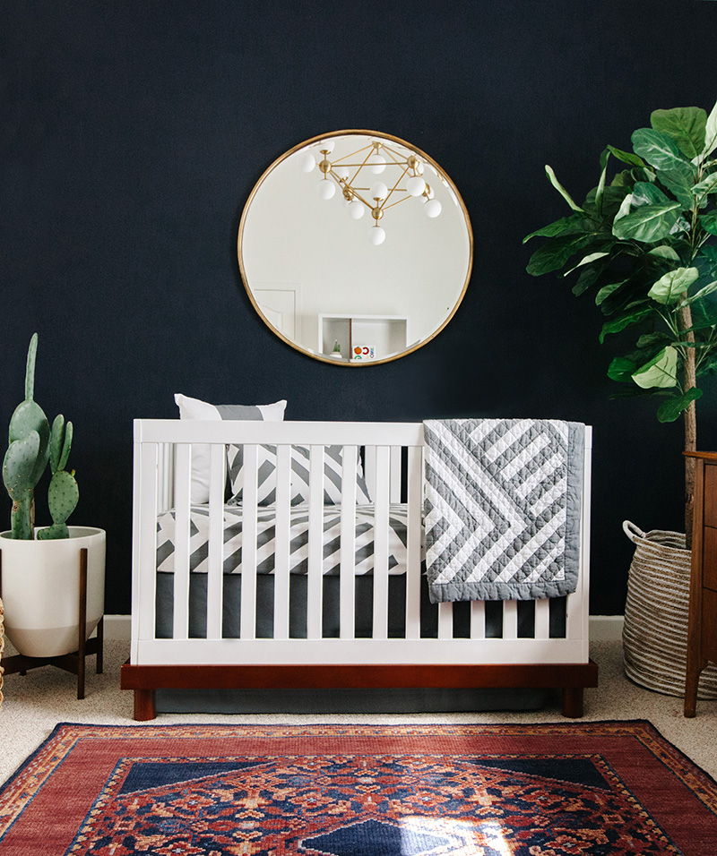
When we moved in, the original space was painted lime green, had an outdated ceiling fan and window coverings that didn't do much to block out light. We repainted the walls Westhighland White and then painted an accent wall Anchors Aweigh blue provided by Sherwin-Williams. We selected a flat finish and used their low VOC Emerald line. The paint alone was transformational.

To dress up the windows and create more darkness, we hung a gold curtain rod with white sheer curtains from Bed, Bath and Beyond. The window actually has a slight arch to it, so Annalisa Thomas from Oilo had the genius idea of covering the arch with a wooden roman shade to make the window appear rectangular and create clean lines.

Whole Room1.jpg

The rug from Lulu & Georgia was the anchoring factor for the room and the inspiration behind the color palette. I wanted something masculine-feeling, and liked the idea of mixing mid-century modern design with traditional elements. (To see a contrasting girl room, check out Elle's big girl room reveal). The round gold mirror makes such a statement too, and is another traditional element that complements the rug. When I pick Levi up after a nap and look at the pair of us in the mirror he always smiles at himself, and, of course, I smile and then want to freeze time forever. Having a mirror in a nursery is not only beautiful, but fun for baby too. Just make sure to secure really, really well and move the crib away from the wall.

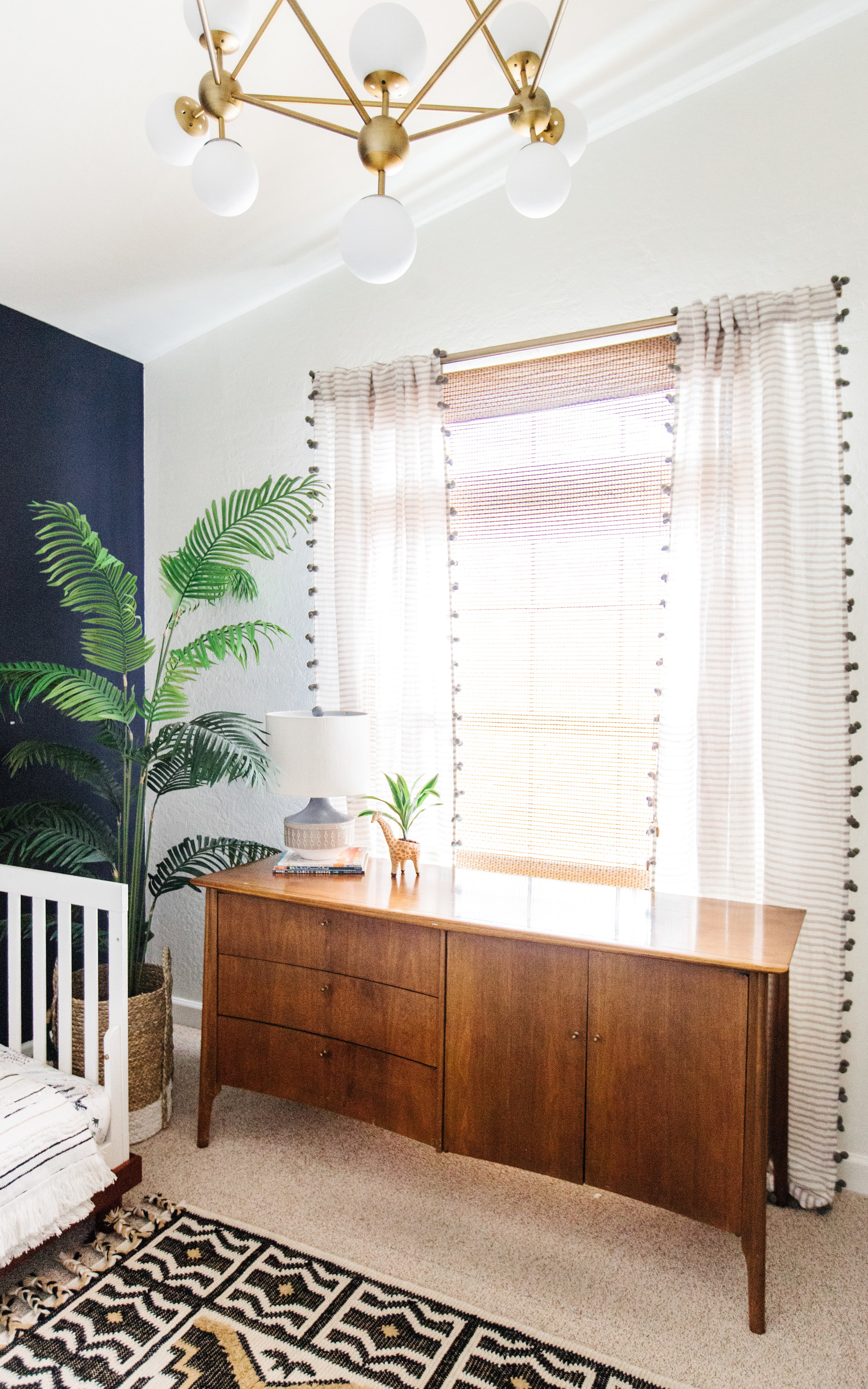
The mid-century elements that are in the space are the side table, planter, gray wingback chair, bubble chandelier and credenza. Every single item is so cool and beautiful I would put it in any space in my home. The chair is perfect for me to read stories to both Levi and Elle. Elle particularly loves to take the stool over to Levi's crib so she can talk to him after he wakes up from his nap. It's the cutest!

Having a side table right next to the chair to set his bottles down on after a feeding or set books on after we've finished reading them it very convenient. When I was nursing I was always looking for a place to set my water on or my breast pump on. I highly recommend investing in a comfortable chair and a side table to go with it. The chair and table are both from Joss & Main.

Annalisa found the coolest chandelier on ShopCandleabra.com. Even though ceiling fans are nice to have they aren't the prettiest. I've taken most of them out of every room in our house and just added a high powered floor fan. My husband wasn't a fan initially, but once he saw the impact of a light fixture and how it elevates a space he became a believer. 

The white crib and the mid-century modern credenza were pieces I had from Elle's nursery. I'm so glad that they worked with this space too. Oilo Studio makes gorgeous, quality bedding for cribs. I have had my eye on this gray and white Zara pattern crib set for a while, and it was such a nice pairing with navy and the traditional pattern in the rug. I wouldn't have put all of these textures and patterns on my own. It really shows you what a designer can do for you. I always end up making things very matchy, matchy.

Living in Arizona, we have cacti all around us. The desert landscape is so beautiful, and I'm so proud to have both of my children be native Arizonans. Annalisa found artwork of a saguaro cactus and prickly pear cactus by WilderCalifornia to breathe Arizona into the space. 

I really wanted to have real cacti in the room as well, but they are obviously dangerous for children. Instead, I found these modern, brass hanging planters and put tiny little cacti in them. I also planted a fuzzy cactus in a small pot and placed it at the top of Levi's bookshelf. Modernica makes high quality, modern planters, and I was able to find a needless cactus to keep beside his crib. It looks perfect with the modern planter. Fiddled fig trees are all over Pinterest, but I don't have a green thumb. Cacti is as close as I get. I was able to find a faux fig tree at Home Goods, and then I placed it in a woven basket, which I also found at Home Goods.

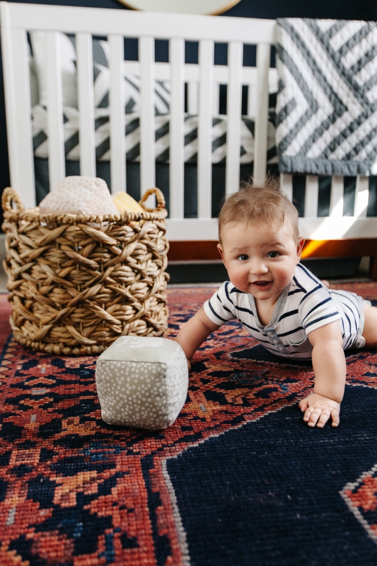
Of course, there has to be some kid elements in the space. The Land of Nod has some of the cutest trinkets and toys for kids. I love this hippo, these gradient blocks, and these soft blocks so much I wanted to display them as much as have Levi play with them. This gold music ball from Design Life Kids was a modern take on a classic childhood toy. I displayed them all on this unique modern bookshelf from Joss & Main. You can style it a million different ways, but I have kept it pretty minimal for now. Elle is hoarding all of the baby books in her room right now. haha.

It's such a joy to walk into this room every day whether it's to change a diaper, feed him at 2am or play with him on the floor. I don't take these luxuries lightly, and I know how much even having a dedicated room for a baby is is a luxury in and of itself. I can't thank Oilo Studio enough for all of your hard work and vision. If you're interested in learning more about the design process for Levi's nursery, be sure to check out Oilo's blog.