ELEMENTS OF AN ENTRYWAY

This is a sponsored post by World Market. All opinions are my own.

First impressions matter. The entryway of your home is your guest's first experience of your style. It's also the last experience of their visit, so you want to make sure it's memorable. Our entryway hasn't been much to look at. Until now, it was just a blank white wall, a wooden front door and wooden floors. Not bad, not great, just there. 

After furnishing my living room, I wanted to make sure that the entryway was just as warm and inviting. I also wanted it to be functional, and have a spot for people to put their shoes on, to check their lipstick their way out and to be able to set their purses down. 

A bench and a mirror seemed like the perfect solution. The warm wood kept the space inviting while the midcentury modern design of the bench and the oversize mirror kept things modern. But, to cozy up the space I found the perfect collection of pillows at World Market.

I kept to the rule of thirds with the pillows, and then I picked up this lovely throw to add some dimension. Adding green plants or flowers to any table or bench is always a good idea too.

I also found a gray floor runner that has flecks of silver throughout. You can't see the sparkle in the photos, but it's really a unique and glam touch to a natural space. The combination of these textiles soften the hard surfaces of the space.

The final touch on the space was to put an interesting piece of artwork on the door. Though the wood is pretty, it was just too plain Jane. I had this woven hanging made by Jenny from Sonoran Handmade.

To get this entryway for your home be sure to shop the space below. Also, World Market still has their living room sale going on. Be sure to shop now before it's over. 

Photography by Rennai Hoefer

GUEST ROOM MAKEOVER & CONTEST

One of the best things about our new home is that it has plenty of space to host friends and family. I've always dreamed of creating a hotel-worthy guest room that made our guests feel welcome and rested. Living Spaces helped make my dream a reality with some of the most beautiful and affordable furniture around, and I'm excited to share it with you (P.S. you can win this whole space).

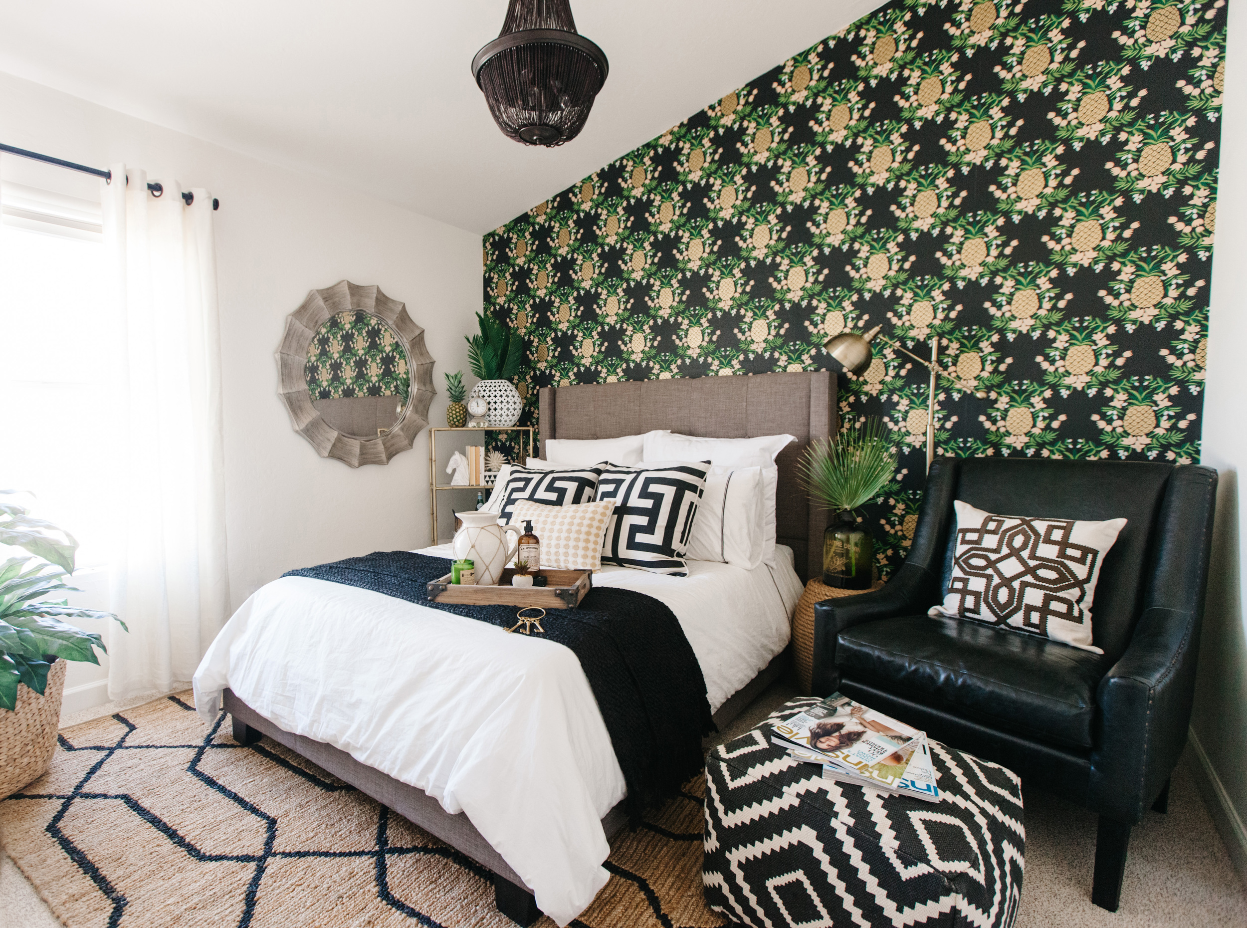
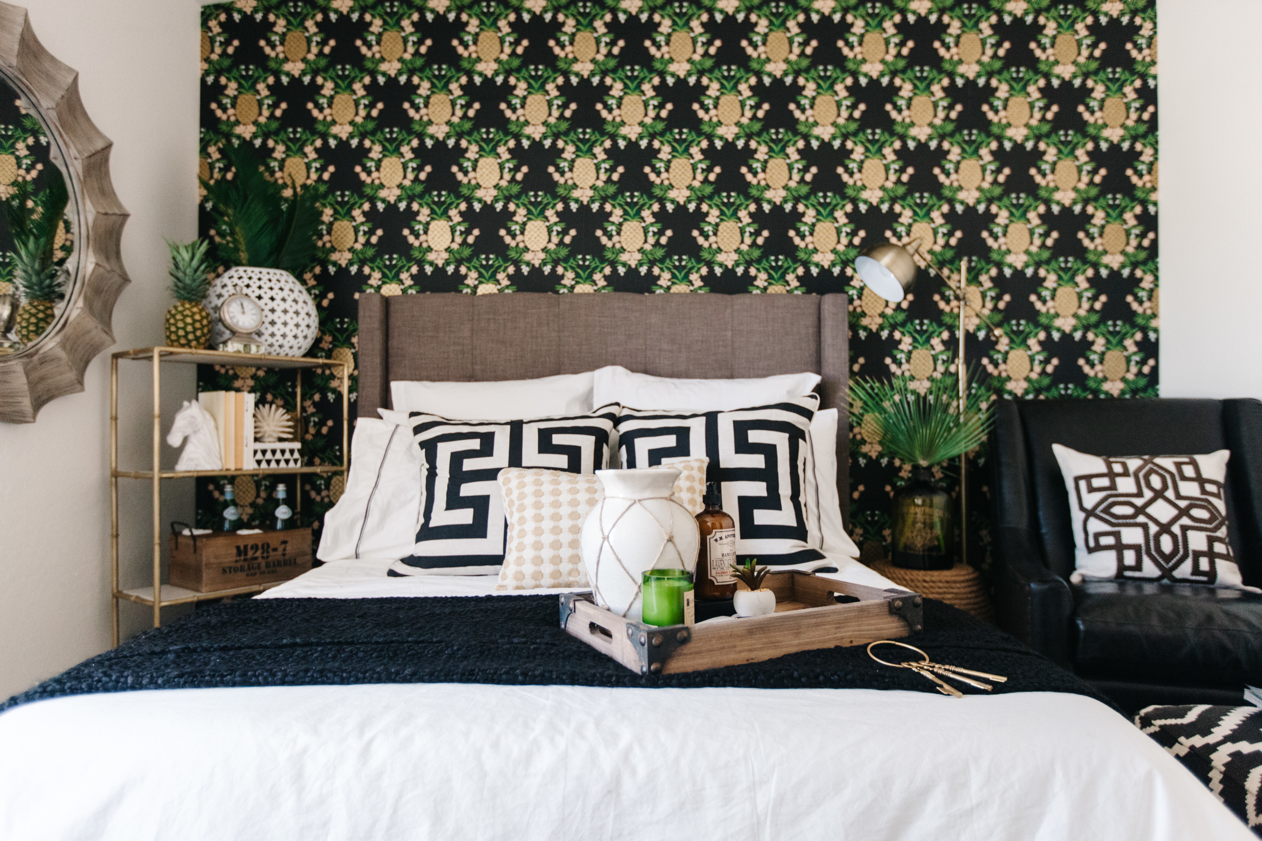
We all know that pineapples are a pin-worthy subject lately, but did you know that the pineapple is a symbol of hospitality that dates back to Christopher Columbus (see more here)? Well, as a woman that loves a good dark wall and one that loves pineapples, when I saw this Hygge & West ebony pineapple wallpaper I knew that this was perfect for my guest room and source of inspiration for the rest of the room.

The color palette was set by this wallpaper, but to avoid it feeling too matchy, matchy I wanted to introduce some natural textures, grays and other patterns. I selected a full sized, gray upholstered bed. It was only $370, and looks like it costs over one thousand. A crisp white duvet is always something you find in hotels these days, but these black and white accent pillows accompanied by a soft black throw made the bed feel even more luxurious.

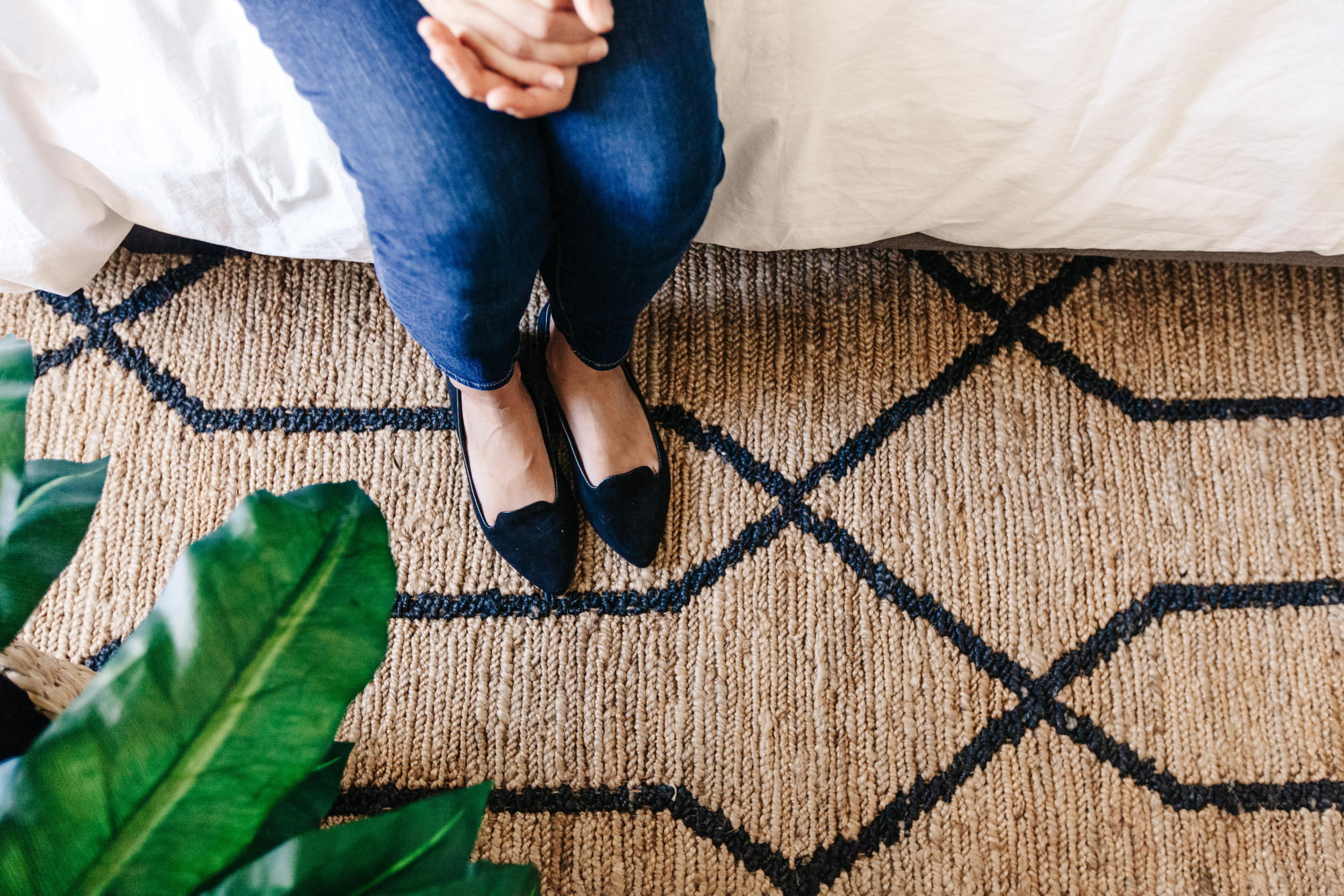
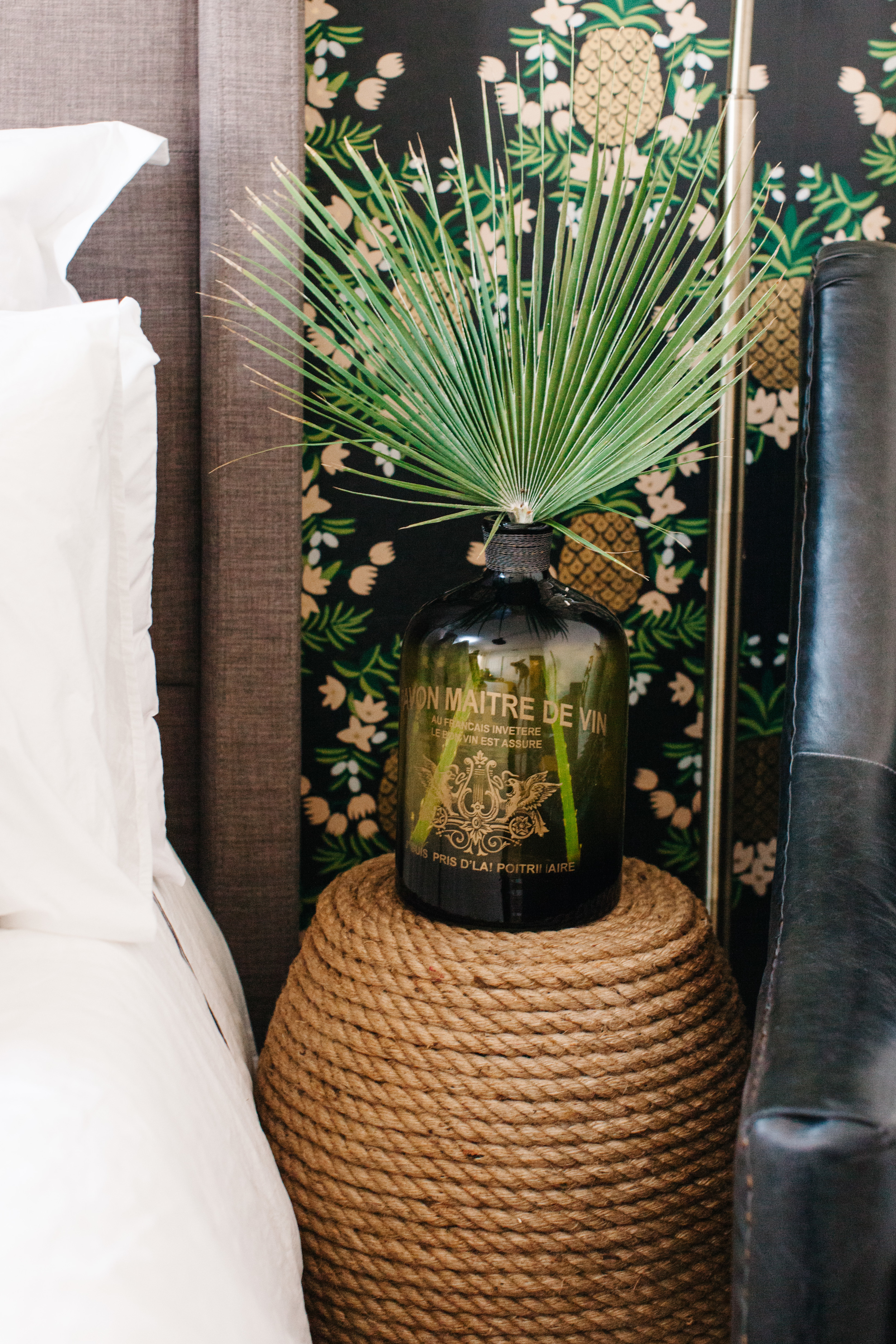
I then picked an area rug to anchor the space, and I fell in love with this jute rug with black lines. Other elements that added this natural quality were an outdoor rope stool doubled as a side table and a woven basket used as a planter.

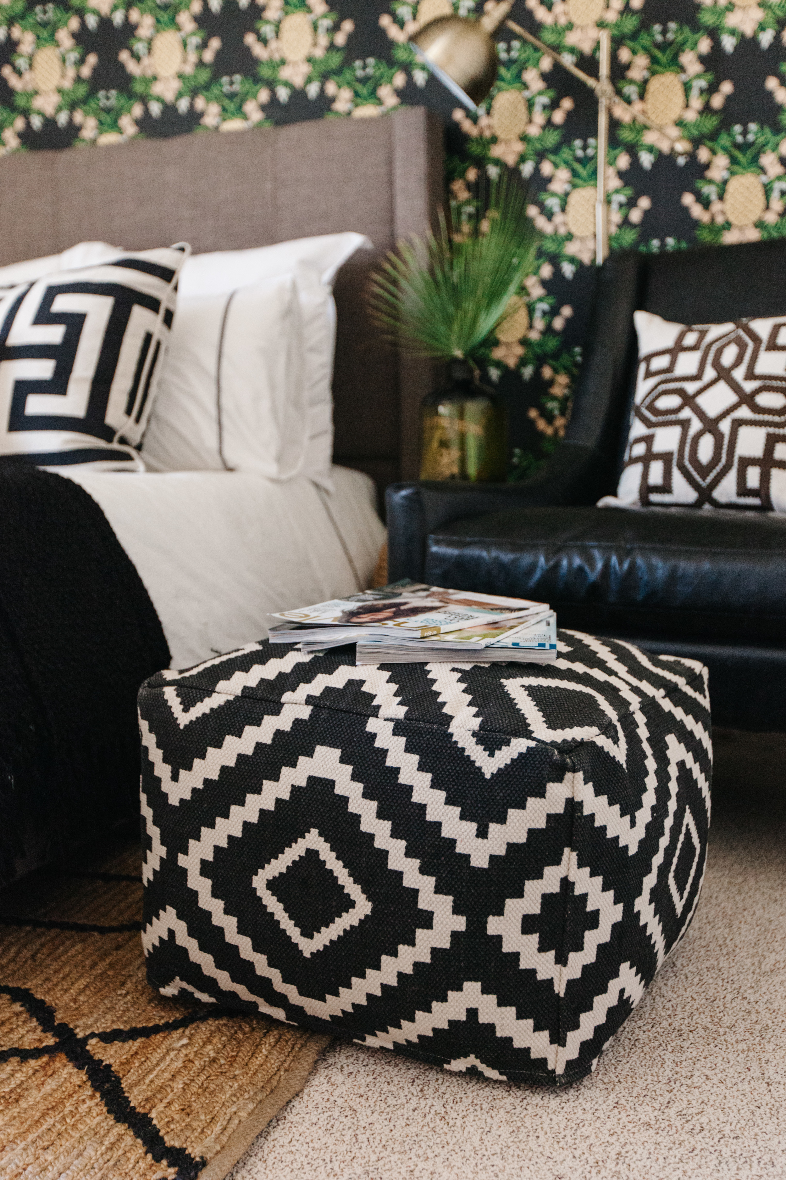
When I think about the different elements that make up a comfortable hotel room a cozy reading chair always comes to mind. This black, brass studded, leather chair is so classic in design and the perfect reading chair for my guests. I added a brass reading lamp next to it that could also be turned if someone decided to read in bed. Of course, being able to put your feet up and relax is important and this printed ottoman called my name.

The room is 11 ft wide and 8 ft deep, so I didn't have too much room for side tables. Instead, I opted for the small rope stool on one side and a brass and marble bookshelf for the other. I decorated the shelves with elements that you would often find in a hotel room such as a clock, books, bottled water, wash cloths and flowers (or in this case palm leaves to continue the tropical flair). You'll also always want a mirror for your guests to check their hair and makeup without having to go down the hall to the bathroom. I love this 44 inch gray mirror. It has an island feel to it and the color softens the room.

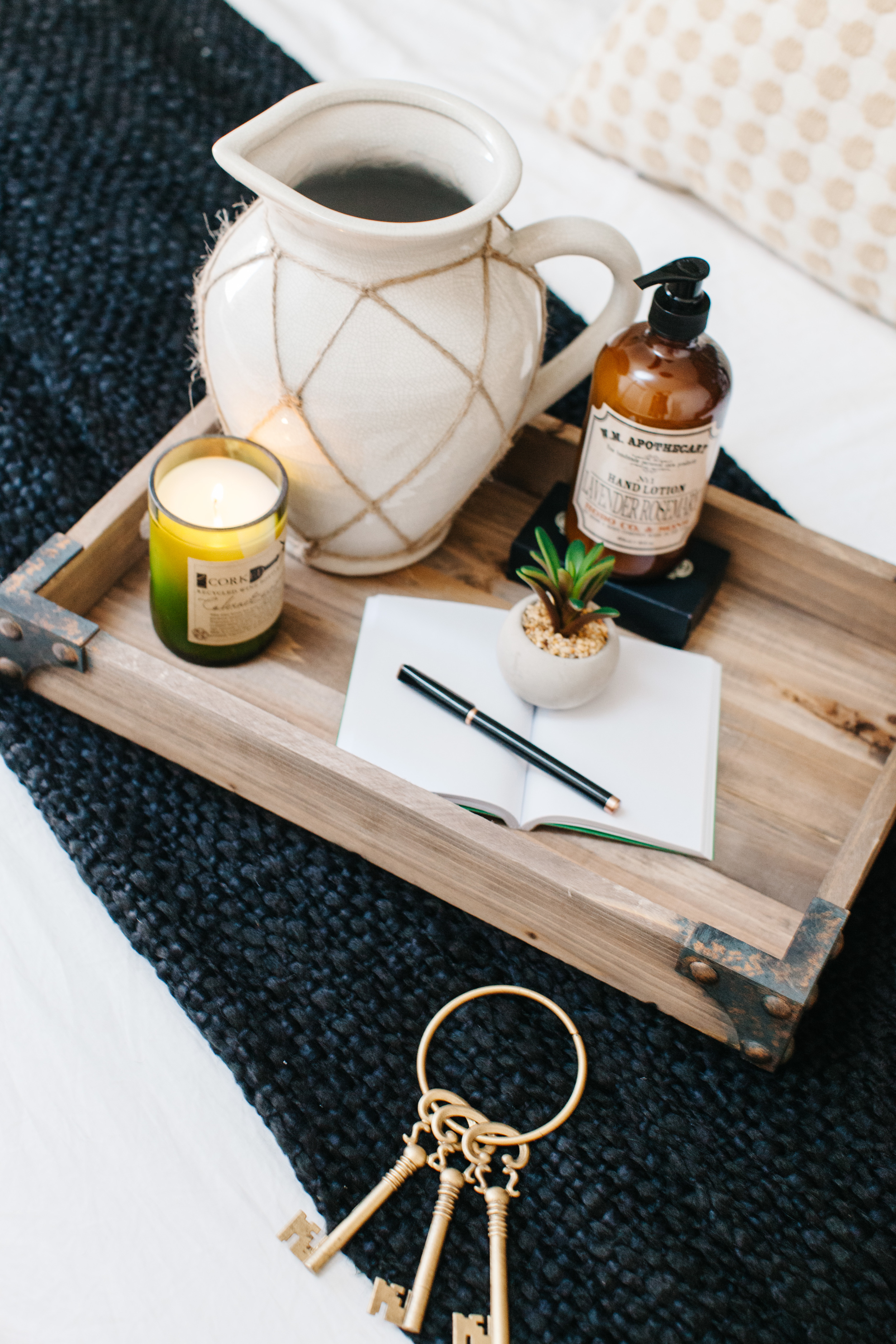
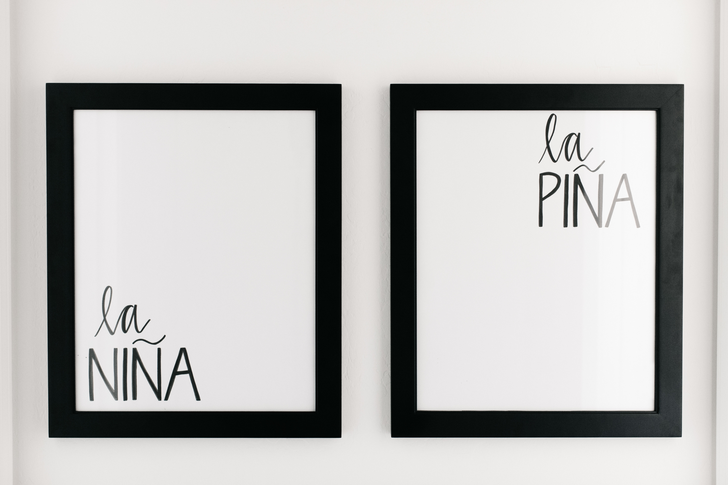
Last, but not least, I made sure there was a tray of welcome gifts and small design accents to make the space feel homey. A pitcher, a notebook for messages, a good smelling candle, wrapped soaps to enjoy, lavender body lotion and even brass keys to make it really feel like a hotel. I even had my friend Katie Sterbenz design a sign for the room showing wear to go to enter the oasis. On the right, the guest room, and on the left, Elle's room.

I hope you love the room as much as I do. I'm considering inviting all tired moms who need some sleep to come and use it. haha! But seriously, if you love this room you can WIN it. Living Spaces is doing a Pinterest contest where you can win a $2,500 gift card to shop this room or buy other elements that make up your dream space. Click here to enter. Be sure to check out their 4th of July sale to find amazing deals too!

To shop the space be sure to visit my Pinterest board with all of the items. 

Photos by Rennai Hoefer
ELLE'S NEW ROOM

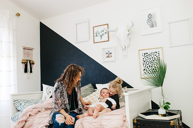
When we moved into our new home last August I was 8 months pregnant with Levi and exhausted. The last thing I could think about what decorating a house, but I knew that making a special space for Elle was a priority. After all, she was going through just as many big changes as we were and trying to comprehend it all at the age of 3. She would talk about her "old house" and sometimes cry saying how much she missed her polkadots (I would start crying too). Her old room had rose gold dots on the wall, and it was her comforting, safe-have. It was all she had known up until now and it was gone, so I knew I needed to find some time and energy to make a cool, new place for her to love.

Elle said she wanted her room to be pink, so we compromised with pink, black and white. I love girly things, but used my editing eye to balance the feminine color with timeless black and white. I took to Pinterest, and I started pinning all sorts of inspiration. You can check out the full Pinterest board here: http://www.pinterest.com/alexandraevjen/girl-room-w-land-of-nod/ 

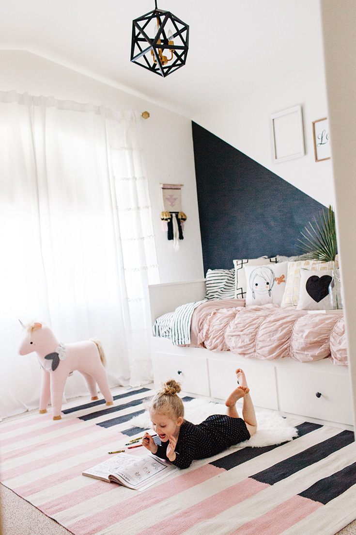
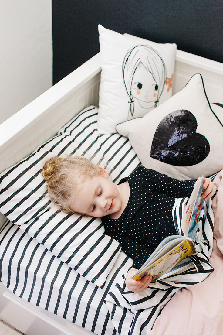
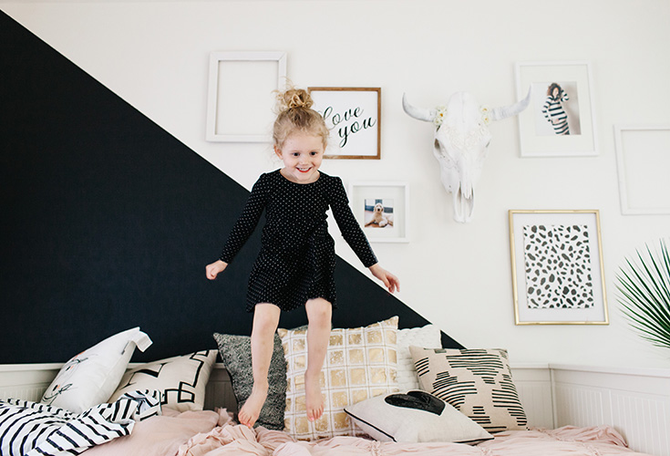
One of the first things we did was upgrade her to a daybed from her toddler bed because Levi would soon need the crib. I chose a white IKEA day bed that turns into a two person sleeper in the anticipation of slumber parties. With a pink ruffled duvet cover and a ton of throw pillows it became the perfect mix of girly and modern. We painted half her wall black similar to a wall we had in our old house. I toyed with the idea of the other half being gold, but I couldn't find gold interior paint that I liked.

Land of Nod was our one stop shop for all of the bedding and curtains. I couldn't resist the gold geometric lamp and the striped rug either.

elleroom.jpg

She had an IKEA bookshelf in her old nursery, and we painted the back of it black to help tie everything together. He brother has most of the baby books now, but I know over the years her book collection will grow and maybe we'll even start to see Seventeen Magazine on the shelves. 

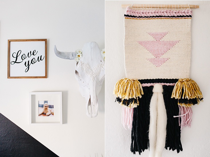
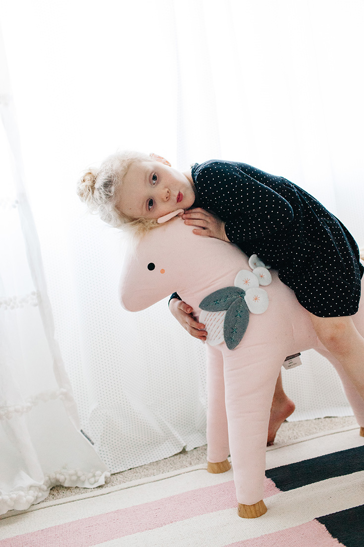
Some items that I included in her room that were Pinterest inspired were a woven wallhanging, a steer skull and a gallery wall. I also couldn't resist putting in a cool pendant light instead of a ceiling fan. I found this one on Wayfair for $219. You can always just put a portable fan in the room for hot nights, right? =)

Now that the room is complete Elle doesn't mention her polkadots anymore. Instead, she jumps off her big girl bed, reads stories under the covers and sleeps soundly in her new house. I love being in her room almost as much as she does. Thanks, Land of Nod, for making great products for parents and kids to enjoy!

Photos by Rennai Hoefer
5 TIPS FOR STYLING A COZY HOUSE FOR THE HOLIDAYS

This post is sponsored by Coca Cola.

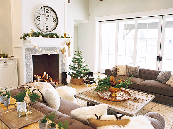
I wish that this was my real house, but the same rules and elements of creating a warm and inviting space shown here apply to mine. What we have here is a gorgeous exposed Rafter House styled by Coley and Lindsey of Junk in the Trunk Vintage Market. The house was our set for a holiday movie night with Coca-Cola licensed merchandise. Coley and Lindsey did an amazing job bringing my vision to life.
Want to make your home feel just as cozy as this? See below for five must-haves to create your holiday gathering space:

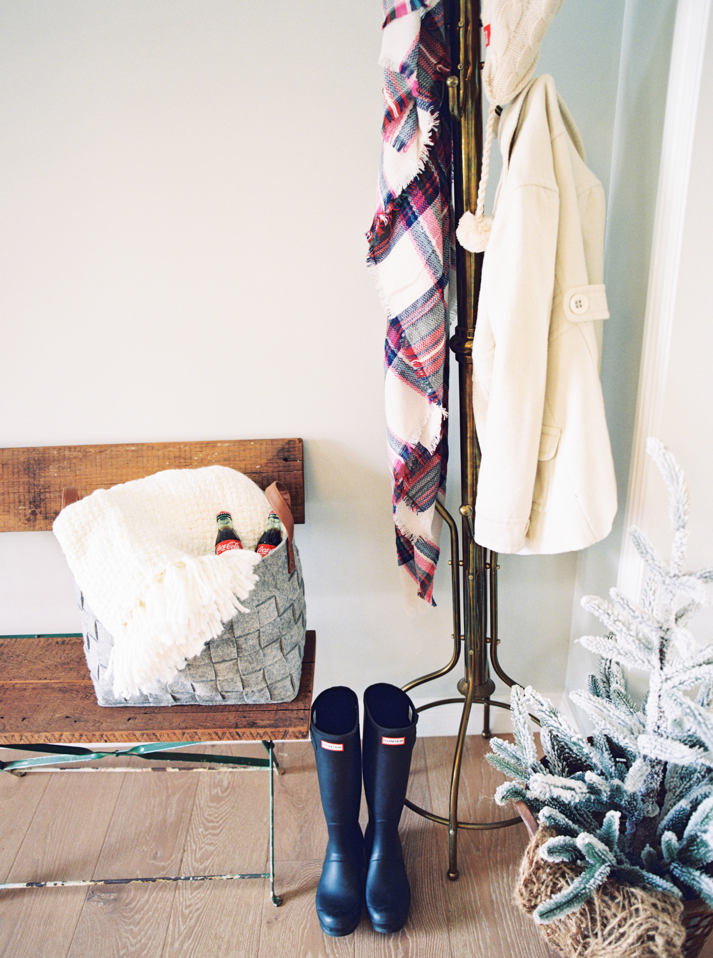
PLENTY OF THROWS - Soft fuzzy textures automatically bring a the level of cozy up 100%. Try layering a mixture of faux fur and knit throws. You can drape them across your sofa or fold them up in a basket by the fireplace. NOTE: Try not to make the blankets look too perfect. You want to make a lived-in feeling, so let the ends of the blankets drape over the basket and let wrinkles lay where they may.

KNIT PILLOWS - Though my husband doesn't always love a ton of throw pillows on a couch they sure do make a space more full and inviting. You can also lay some on the floor by the fireplace to create an invitation to come, sit and stay awhile too. You can find this Vintage Coca-Cola Graphic pillow here.

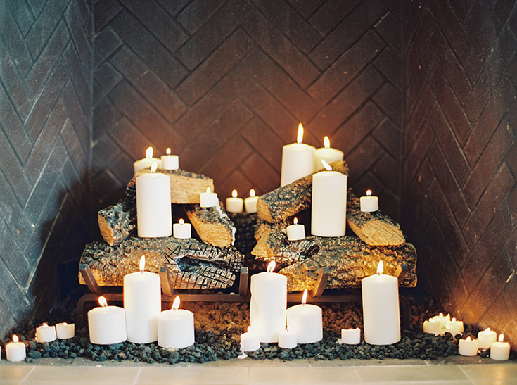
CANDLES - There's nothing like the warmth of candlelight. Placing candles throughout your home is always a great way to make someone feel at home.

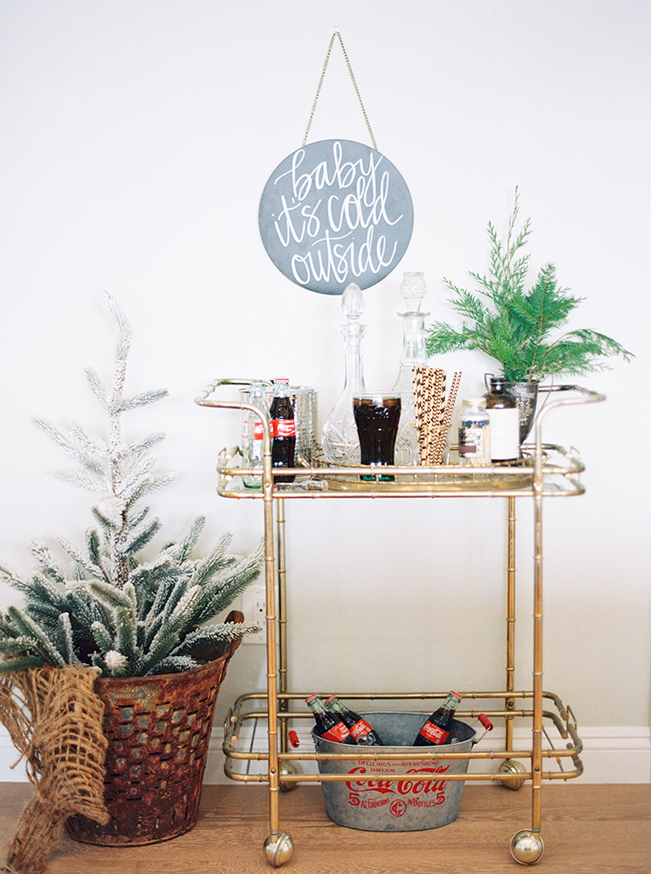
BRING THE OUTDOORS IN - Fresh pine, evergreen and burning firewood -those are the smells of winter. Bring those comforting scents indoors by placing fresh evergreen and pine in vases. 

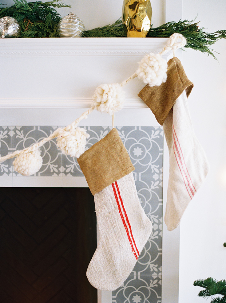
STICK WITH WARM, NEUTRAL COLORS - A lot of color can be fun, but not all colors make you feel relaxed. In fact, color theory suggests that red, yellow and orange tones can make people feel more energetic. Of course, around the holidays we want to have some red in the mix, so try to use it as an accent to brown, ivory and gray.

Photos by Melissa Jill, Art Direction AVE Styles; Prop styling by Junk in the Trunk Vintage Market; House courtesy of Rafter House; Hand-written art by Katie Sterbenz.

SUBURBAN KITCHEN TRANSFORMATION

We always said we would never live in the suburbs. Well, never say never folks because we are rockin' the suburbs now. Maybe the minivan will come next because we also said we would never buy one of those too. We moved away from the city because Ryan was commuting an hour each way to work and we were craving way more family time. It was bittersweet to say good-bye to our cute 1950's ranch house and buy a home in a development where all of the architecture looks the same. Afterall, it was our first house, the place we brought Elle home to and we had put a ton of work into it.  

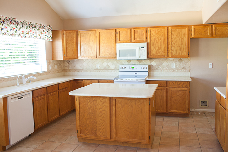
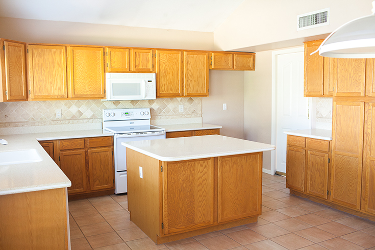
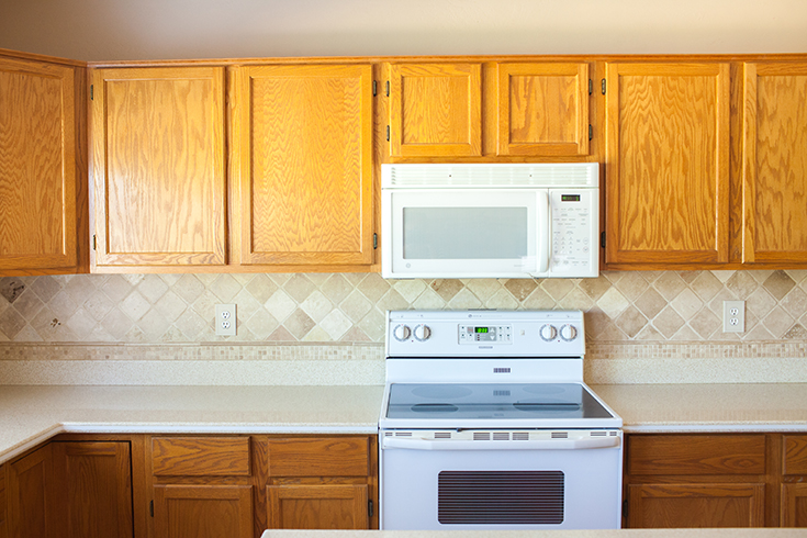
When we found our new home we knew it would need some work to update it, but the layout and bones were perfect. Ryan and I decided the first thing that we would going to do was repaint the whole house white, replace the flooring downstairs and upstairs and get new appliances. We wanted to start with a clean slate, and the first room to tackle was the kitchen.

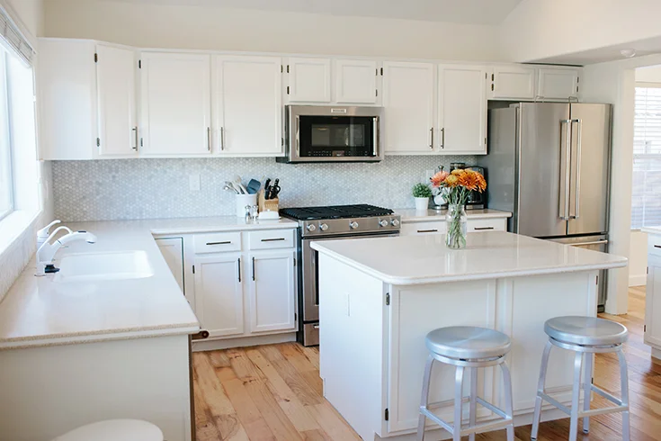
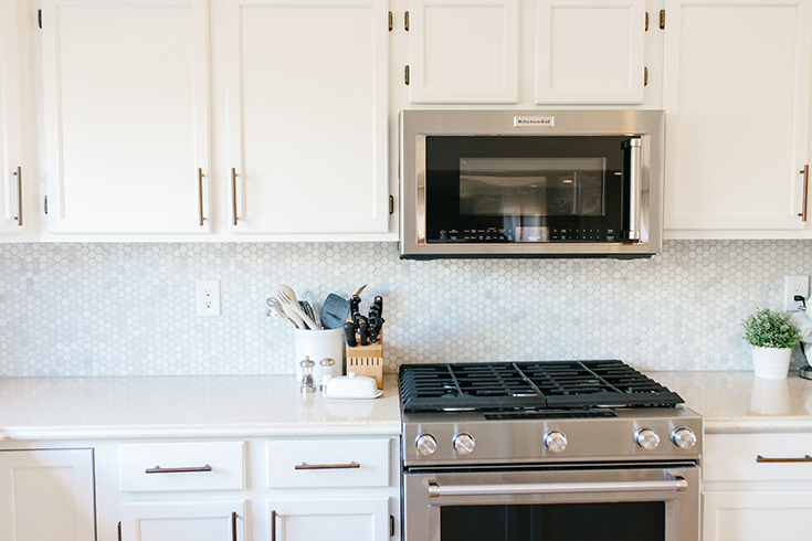
As I am sure you know everyone congregates in the kitchen no matter how big or small. You cook three meals a day in there, and with little ones I'm always in there getting snacks too. This kitchen had the original appliances from the 1990's. They were functioning, but the oven seemed like it was going to fall over when you opened the door. We upgraded to stainless steel Kitchen Aid appliances. Though their original oven was electric we saw there was a gas line available, so we chose a gas stove. We are super happy with everything except the fridge. It feels a bit cheap when you open the freezer. 

We chose to pain the walls and cabinets West Highland White by Sherwin Williams. We LOVE this white. It's warm and bright and not too yellow at all. For the new floors we picked out a hand-scraped hickory that had a lot of color variation. We wanted to minimize the appearance of scratches or marks, and we are sooooo happy with this choice. It goes with all of our furniture really well.

I knew I wanted to add hardware to the cabinets. I was toying with the idea of gold handles, but I would have add to change out all of the hinges because you could see the antique brass poking through. Instead, I went with antique brass modern handles from PullsDirect.com. They were under $3 a handle verses $8 to $12 for gold. With 30 cabinets to accessorize you bet I went with the cheaper option. 

We weren't in love with the existing beige speckled countertops, but we didn't have the budget to replace them all. Instead, I found mini hexagon marble tiles that had some flecks of brown in them but also incorporated gray and white. By splurging on carrera marble we were able to elevate the kitchen without having to spend the extra amount on the countertops. 

We are so in love with our newly upgraded kitchen. It finally feels like "us." Sadly, however, a month after we renovated our kitchen flooded and destroyed our new floors and lower cabinets. Luckily we have some leftover wood and the damage isn't too bad, but it definitely is frustrating that we have to rip up the floors again. Oh well! That's life I guess. haha.